Hi, I’m Harish T P
a
Visual story teller
UX Designer
User Experience manager focused on rich user-friendly interactive solutions. Specializing in the design of usable website, mobile applications. Working with a vision to become information architecture. Accomplished designer with outstanding interface performance analysis, project modeling and mapping skills. Analyzed, documented and reported challenges affecting interface output. Critical thinker with great analytical background. Over 12 years of experience working in an environment of my passion, in the area of user experience design, designing for the web, interface design, interaction design, user experience design and usability. I have worked with notable software organization including Dell Technologies, Hewlett-Packard
What I Do
UX Consulting
As a UX Consultant, I specialize in designing intuitive and user-centric digital solutions that bridge the gap between user needs and business goals. With a keen eye for detail and a passion for enhancing usability, I transform complex challenges into elegant, user-friendly interfaces that drive engagement and satisfaction. Let's collaborate to create meaningful interactions that resonate and inspire.
User Research
My expertise lies in conducting comprehensive user research to uncover invaluable insights that shape impactful design decisions. By employing a diverse range of research methods, I extract user preferences and behaviors, providing a solid foundation for crafting tailored and empathetic experiences. Let's embark on a journey of discovery to create products that truly resonate with your audience.
SEO Optimization
As an SEO Optimization specialist, I specialize in boosting website visibility and organic traffic through strategic keyword analysis, on-page optimization, and technical enhancements. With a data-driven approach, I help businesses climb search rankings, ensuring their digital presence thrives in a competitive landscape. Let's collaborate to unlock the true potential of your online platform and drive sustainable growth.
Accessibility Advocate
As an Accessibility Advocate, I am dedicated to making digital experiences accessible to all, regardless of disabilities. I assess, advise, and implement solutions that adhere to WCAG guidelines, fostering an inclusive online environment that values diversity. Join me in creating digital landscapes that prioritize equity, empathy, and a seamless user journey for everyone.
Usability Testing
I specialize in conducting rigorous usability tests that uncover valuable insights, ensuring your digital solutions resonate with your audience. By analyzing user interactions and feedback, I refine designs to maximize ease of use, leading to seamless, engaging, and impactful experiences. Join me in optimizing your products for ultimate user satisfaction.
Visual Design
With a passion for Visual Design, I bring concepts to life by crafting captivating aesthetics that align with brand identity and user preferences. Through thoughtful use of color, typography, and imagery, I create immersive digital experiences that leave a lasting impression. Let's collaborate to turn ideas into visually stunning realities.
UX Case Studies
Design Brief
Dell Technologies’ homepage needs to be redesigned to better connect with its audiences including consumers, small and medium businesses, and Enterprise. One-liner brief: Appealing design like apple and transaction like Amazon.
My Role
- Research
- Project time estimatiion
- Requirement Gathering
- Deciding on the Process
- Stakeholder Interaction
- User Testing
- UI and Visual Designs
- Partner with Engineering team
- Helping on Front-End Development
- Workshop Facilitation
Objective
Provide an experience that conveys our brand and corporate values, provides clear and direct navigation to Dell products and services, and promotes a successful completion of purpose.
The Process
We follow a Discovery and Faming process.
Goals
Business Goals
- Increase in click through rate and customer engagement
- Reduction in exit rate
- Reduction in bouse rate
- Increase in organic search traffic
- Increase CSAT
- Premium perception
- Brand love
Product Goals
- Increase Quality
- Increase Stability and Reliability
- Decrease page load time
- Google page speed score above 80
- 100% accessibility compliance
- Personalization
- Governance of quality
Anti-Goals
- Increase RPV
- Increase RPVr
- Increase AOV
- Increase Margin per visitor
- Increase CV
Stakeholder Mapping
Research
Baymard Research Findings
As not to reinvent the wheel again, we went through the research papers of Baymard to understand which are the top performing e-commerce website where Dell stand and what is their suggestion to improve the page.
Even though Dell is in a good position, we wanted to improve further.
Competitive Analysis
Compare a few competitors’ websites and analyze what they are doing differently from others, and what each company is doing better.
Samsung
- Clean design, shows all major categories of product
- Shows sustainability
- Showcases the latest innovations/products. Calls out of new arrivals
- Uses bigger/bold fonts – but not too much text
- Discounts are displayed, but in only one place, not distracting from the rest of the page.
- Using tables on different modules to unfold more content on user clicks
- Using hover to unfold more information
HP Enterprise
- It is a different site altogether from a retail site
- Using a large above-the-fold banner with a carousel (no auto-rotate, only on user click)
- –Banner links user to ebook/PDF
- On scroll sticky masthead. On page load masthead and on hover masthead are slightly different. I think the masthead is a transparent background on the page load.
- Lots of big images and some image overlays
- Subtle animation on part of the page
- Highlights – HP Greenlake/cloud/services and less about products
- Lots of interactive elements to show/hide content
- Link to a virtual tour
- Highlights sign in
Research Existing Analytical Data
Analyze current design As the first step in the research, we analyzed our existing homepage using content square (formally clicktale). Our objective was to check where we get more engagement, and more conversion and also understand what is the reason for less engagement in some sections of the page.
Key findings
- Users are using the laptop and desktop categories the most.
- First-time users use main navigation more
- 82% of home page category purchases buy on the visit and are the fastest purchasers of any segment
- The main navigation is the most used feature on the homepage followed by search.
- 46% of users scroll only till they populate categories.
we then synthesized the analytical data and made affinity mapping of the findings based on the commonalities the commonalities.
User Interview
By this time we had enough data to go to users to gather their pain points. Having all this data was very easy for us to write a script for user interviews.
Conducted user interviews for B2B users, B2C users, and Gamers. We recruited users through the usertesting.com platform.
Key Interview Takeway
Problem Prioritization
This time we got most of the stakeholders and we did the problem prioritization. We could able to refine the problems which needs to be addressed first.
Discovery Takeways
Brand: Effectively communicate on the homepage that Dell Technologies provides complete E2E technology needs
Personalization: Cold state: showcase the breadth of products and solutions for a broad spectrum of customers.
Warm state: Provide more relevant content that aligns with each persona and supports navigation paths.
Navigation: Our target audience is very broad, from consumers to enterprise customers. Creating a clear entry path for each target audience guides their journey.
Content & Experience
- Storytelling: focus on highlighting user needs and benefits instead of product features.
- inspire and increase customer engagement using immersive and relevant content.
- Highlight new/special products. services solutions etc.
- Show value proposition
Wireframing
Crazy 8’s is a core Design Sprint method. It is a fast sketching exercise that challenges people to sketch eight distinct ideas in eight minutes. The goal is to push beyond your first idea, frequently the least innovative, and to generate a wide variety of solutions to your challenge.
Iterative Approach
From the Ideas I gathered during the Crazy 8 rapid prototyping, I went ahead with asking the stakeholders to vote took the winning prototype, and created an interactive prototype using webflow so that I could run quick user testing.
- Learning from the testing of the prototype:
First time
- users look for product categories. The mental model of the user is to see small category strip above the first first
- The design we tested with bigger product category thumbnail did not resonate with the user.
- Users has banner blindness in many sections in the homepage
- Users are least interested in the sections which has just products.
- Users expect newly launched products in the hero banner
Returning User
- Returning users would like to see the products which they are interested in (personalization)
- Users were happy when they are shown the products which browsed in the past. Products similar to what they browsed in the past
- Chances of purchasing the products increased when we compared the price compared to previous visit (discounted price)
Returning Customer
- Returning customers were able to browse the compatible accessories without much research.
- Showing order status was very easy for the users, they could see the status without going to the account page
- Showing products in cart was interesting for many users.
Users felt the design was lacking in recommending products based on their job/industry etc.
I continued to iterate the designs on the feedback we received from users.
Recommended designs


Thinking Beyond the Ask
I tried one more addition idea of navigating by just using voice commands.
Advantages of this:
- Easy navigation just by using voice.
- Voice will be additional navigation option for main navigation and search
- Can collect these data and identify the user intend and personalize content
- Users will be more open to voice than typing
- In case users has additional questions, we can direct them to live customer executives. Users will be continuing in the same experience.
Outcome
Learnings
- Returning visitors are more likely to purchase products
- Personalization help the user in purchase decision
- If the personalization is not perfect, don’t do personalization
- Too many marketing content will make banner blindness in the user
Next Step
- Continue iterate based on the feedback we receive from the user.
- Make personalization perfect so that we can understand the intend of the user.
Optimizing User Experience: A Case Study on Achieving 17% Higher Engagement and 5% Increased Sales in Dell Product Sections
Quick Overview
Contributions
- User Research & Stakeholder Interviews
- Competitive & Market Research
- User Persona & Journey Mapping
- Wireframing & UI/Visual Design
- Usability Testing & A/B Testing
- Workshop Facilitation
Framework
- Discovery & Framing
- Double Diamond Process
- Design Thinking
Impact
- 4X easier navigation (as reported by users)
- 17% increase in engagement on new sections
- 5% increase in Dell product sales
- 3% decrease in bounce rate
Impact
4X easier navigation (as reported by users)
17% increase in engagement on new sections
5% increase in Dell product sales
3% decrease in bounce rate
The Process
We follow a Double diamond (discover and framing) process in our product design
Stakeholder Mapping
Background
Dell.com Premier is a leading B2B e-commerce platform offering IT solutions worldwide. While the platform has been reliable for years, Dell leadership wanted to modernize the homepage to align with evolving standards and user expectations.
The Challenge: Balance Dell’s need for a refreshed look with preserving the usability that existing customers valued.
Problem Statement
How can we redesign the Dell.com B2B homepage to:
Deliver a modern and engaging experience
Retain the functional strengths of the legacy platform
Ensure usability, accessibility, and responsiveness across devices
Strengthen Dell’s brand identity
Market & Competitive Research
Analyzed B2B e-commerce competitors (HP, Apple, Google, Cisco, Alibaba, etc.) to identify best practices.
Key findings included:
Special categories above navigation (Lenovo, HP)
Minimalistic layouts (Apple, Google)
Vibrant imagery & brand voice (Apple, Logitech, WeWork)
Grid & card-based layouts (Samsung, WeWork, NetApp)
Accordion/collapsible articles (Cisco, Asana)
Interactive components & clear CTAs (WeWork, Asana)
After gathering the research data, we wanted to understand who are all performing better in this industry and what are their strengths and weakness and also wanted to understand what they are doing differently from others, and what each company is doing better.
Quantitative Research
Surveyed 157 Dell Premier users across America, Europe, and APAC.
32% prioritized intuitive navigation
18% wanted quick access to support
Customization & quoting tools had less demand
Market Research
When I started to gather existing market research for similar industries, I found some alarming facts about the B2B e-commerce industry. Which made us even more serious about our exploration and research.
Gathered insights via Voice of Customer (VOCAAS) feedback
Conducted stakeholder interviews
Synthesized pain points into How Might We (HMW) statements
How Might We Statement
How might we help users quickly access frequently purchased Dell products?
How might we show relevant updates on order status and quotes?
How might we simplify navigation to reduce effort?
User Interview
Problem Prioritization
Once we have gathered all the pain points from stakeholders, and users and also by analyzing the data, we came up with a few problem statements. Since our plan was not to solve all the problems at a time, we prioritized the problems.
User Persona
User Journey Map
Ideation & Wireframing
Facilitated workshops where participants sketched 8 design ideas each → shortlisted through dot-voting → evolved into wireframes.
Before
After Redesign
User Testing
Conducted unmoderated tests via usertesting.com
Key outcomes:
74% said navigation became 4X easier
95% reported reduced effort to find information
100% confirmed overview features reduced page-hopping
Positive verbatim: “Cleaner, more concise, categories outstanding”
74%
users mentioned new product category made navigation 4X easier
15 of 18
users expressed that the design is Compelling and Nice
95%
Users mentioned the new design take less effort to get what they are looking for
100%
Mentioned showing overview will reduce effort of going to different pages
Some of the verbatim from the user testing
AB Testing
Tested redesigned order status integration
Resulted in:
17%
Engagement on the newly added sections.
5%
Increase on the shop Dell product section
3%
Decrease in bounce rate
Final Impact
Modernized Dell’s B2B homepage while preserving usability
Increased engagement and conversions through research-driven design
Created a framework Dell can apply to future redesigns
Thinking beyond
Improved Accessibility: Voice-based navigation makes websites more accessible to individuals with disabilities, including those with visual impairments or motor disabilities. It allows users to navigate and interact with the website using their voice, eliminating the need for a mouse or keyboard.
Enhanced User Experience: Voice navigation can provide a more natural and intuitive way for users to interact with a website. Users can simply speak commands or questions, making it easier to find information, access features, and perform tasks on the site.
Efficient and Hands-Free: Voice navigation can be faster and more efficient than traditional point-and-click methods. Users can quickly jump to specific sections or pages on the website without the need to scroll or click through menus. It’s also hands-free, which can be especially useful in situations where users have their hands occupied (e.g., cooking, driving).
Multilingual Support: Voice-based navigation can offer multilingual support, allowing users to interact with the website in their preferred language. This can be a significant advantage for websites with an international audience.
Personalization: Voice assistants can use natural language processing and machine learning to understand user preferences and behavior. This enables websites to offer personalized recommendations, content, and experiences based on the user’s voice interactions and history, creating a more tailored and engaging user experience.
Design delivery
Final designs will be delivered with detailed engineering and marketing guidelines.


HPE OneView Firmware update
Impact
Improved confidence in firmware updates → Increased adoption and smoother IT operations.
Goal
Design a seamless, reliable, and low-friction firmware update experience that IT admins could trust and complete without hesitation.`
The Problem
Updating firmware in HPE OneView was a tedious and error-prone process.
IT admins lacked confidence in whether updates would complete successfully.
Downtime was unpredictable, often exceeding allowed maintenance windows.
Limited visibility into package size and available appliance space made updates risky.
As a result, many admins avoided updates altogether, leading to outdated systems and degraded performance.
My Role
- UX Designer
- Research
- Interviews
- Wireframing
- Task Flow
- Design
My Role
- Stakeholder & user interviews
- Persona refinement
- User journey mapping
- “How Might We” ideation & workshops
- Task flows & wireframes
- Final design
What is OneView
HPE OneView lets businesses simplify and automate today’s complex hybrid IT infrastructure. Through software-defined intelligence, HPE OneView takes a template-driven approach to deploying, provisioning, updating, and integrating compute, storage, and networking infrastructure. Designed with a modern, standards-based API, HPE OneView also helps users develop applications faster through integrations with a broad ecosystem of third-party management services and tools.
The Process
Research & Insights
I conducted stakeholder sessions and admin interviews to uncover pain points.
Key findings:
“No assurance the appliance won’t crash after an update.”
“We don’t know how long updates will take—it often exceeds downtime.”
“We can’t see package size or space requirements upfront.”
Admins constantly had to monitor for new critical updates manually.
These insights shaped the foundation for design opportunities.
Persona & Journey Mapping
Since the existing personas didn’t cover my use case, I refined them to reflect IT admins focused on maintenance tasks.
I then created a journey map highlighting frustration points during each stage of the firmware update.
User Journey Map
After we came up with the persona, the next task I did was to create a user journey map for this particular use for this particular role
User Interivew
we collected a few end user feedback which we received during our interviews prior to my joining. Following were a few points.
- No assurance that the appliance will not crash after the firmware bundle
- we don’t know the time taken to do the update upfront. some time it will go beyond the downtime allowed.
- will not give the space needed in the appliance
Other key feedback recieved from the IT admin who is responsible for doing the firmware bndle.
- alwasy need to be alert and keep checking for any new critical update available in any hardware
- many times we will not know the package size
Design thinking workshop
Once after identifying the problems my task is to find as many possible solutions as possible. and validate the solutions by doing user testing and then take the best design for further design and development.
we got many different directions.
- make it gamification so that everyone can complete the firmware update in time.
- give points to each firmware update.
- user rating and reviews for each firmware bundle so that the one that is going to update will get confidence about the bundle
- and get the space needed for the bundle and available space in the appliance upfront prior to the update.
Design Opportunities (“How Might We”)
How might we build trust in the firmware update process?
How might we provide clarity upfront (time, space, risks)?
How might we make updates automatic and less reliant on user vigilance?
Ideation & Concept Exploration
During design thinking workshops, we explored different directions:
Gamification: Reward completion of updates (points, ratings, confidence indicators).
Transparency: Show required space, bundle size, estimated update time.
Community trust: Ratings/reviews per firmware bundle to build confidence.
Automation: Reduce manual steps and checks for admins.
Task Flow & Wireframing
I created task flows and wireframes to validate solutions with users quickly.
Testing showed admins responded positively to:
Clear pre-update information (time, space, impact).
Simplified flows with fewer manual interventions.
Confidence indicators that improved trust in completing updates.
Final Designs
The final design incorporated:
Pre-update summary screen with estimated time, required space, and risks.
Automatic detection of critical updates.
Confidence-building UI: ratings, reviews, and progress indicators.
Simplified one-click update flow.
Result: Increased trust and adoption of firmware updates, reducing risk of outdated systems and downtime.


Additional Recommendation


NutriGuide
Nutrition guide App to track the nutrition consumption by family based on the current health condition and purchase.
Project Overview
Revolutionize wellness with our cutting-edge nutrition app, delivering personalized dietary guidance and fostering a supportive community. Elevate health outcomes through data-driven recommendations, while driving engagement with features like personalized profiles, recipe sharing, and expert-endorsed advice. Transform user behaviors, optimize well-being, and establish credibility in the health-tech landscape
My Role
- Research
- User Interview
- Wireframe
- User Flow
- UI Design
Problem Statement
Develop a nutrition recommendation app that addresses the challenge of providing personalized and evidence-based dietary guidance to users. The app should consider individual health goals, dietary preferences, medical conditions, and lifestyle factors to offer tailored nutritional advice and meal plans. The aim is to empower users to make informed decisions about their diet, optimize their overall health, and work towards achieving their wellness objectives.
Objectives & Goals
Goal is to develop and launch a nutrition recommendation app that provides users with personalized dietary guidance, empowers them to make informed nutritional choices, and supports their journey towards improved health and well-being.
Our Process
Process chart
Business Challenges
- Implementing a robust personalization system requires sophisticated algorithms and data processing, which can be technically challenging and resource-intensive.
- Maintaining a diverse and high-quality database of fruits vegetables and groceries and recommendations demands ongoing curation, testing, and updates to ensure user engagement and satisfaction.
- Sustaining user engagement beyond the initial excitement can be challenging
- Developing a monetization strategy that strikes a balance between offering valuable free features and enticing users to upgrade to premium
- Building partnerships with grocery shops for an easy purchase experience and partnerships with healthcare providers and professionals to refer users to the app
Quantitative Research
Sent out a survey to gather information about user expectations and also to understand what users are using and looking for.Received around 60 responses, below are some numbers from the survey
Qualitative Research
User Needs
- Users want an app that understands their uniqueness and provides recommendations that cater to their specific needs.
- User wants to trust that the app’s advice is backed by scientific research and endorsed by experts such as registered dietitians.
- User needs an app that offers convenient meal planning, easy-to-follow recipes, and streamlined grocery lists to simplify their dietary choices.
- Users want an app that keeps them engaged and motivated on their wellness journey
- The user wants an app that educates them about nutrition, helping them make informed decisions and empowering them to sustain healthy eating habits beyond the app.
Competitor Analysis
User Persona
Task Flow
Implications
- The app could lead to heightened awareness among users about their family’s nutritional intake and health conditions. By providing insights and recommendations, users may make better-informed dietary choices, leading to improved overall health.
- The app’s ability to offer personalized recommendations based on individual health conditions can lead to tailored dietary plans.
- Families can collectively manage their nutritional goals and health conditions using a single platform.
- The app’s analysis of health history and nutritional intake can empower users to make more informed decisions about their eating habits.
Next Steps
- User Test the designs and make required changes
- Design detailed designs for each screens
- Partner with online grocery shops, and vegetable shops to find out if we can collaborate and deliver the items
- Partner with food bloggers to create customized recipes for the app user
- Create a community of app users, and other partners.
HPE OneSphere
HPE OneSphere: Simplifying Kubernetes Onboarding on Bare-Metal
From 6 minutes → 2 minutes in onboarding time
Your Role: Lead UX Designer (Research → Prototyping → Testing → Final Design)
Overview
HPE OneSphere is Hewlett Packard Enterprise’s cloud management platform, designed to simplify hybrid cloud management—spanning on-premises infrastructure and public/private clouds.
In this project, the focus was on a critical pain point: onboarding Kubernetes clusters on bare-metal servers. The process was manual, complex, and prone to errors, causing delays and limiting adoption.
The Challenge`
“Onboarding Kubernetes on bare-metal was too complex.”
Complex: too many manual steps
Unclear: master nodes not easily identified
Time-consuming: ~6 minutes, error-prone
Project Goal
Statement: Simplify Kubernetes onboarding → faster, transparent, and error-free.
My Role
- UX Research & Persona Refinement
- Competitive Analysis
- Task Flow Mapping
- Wireframing & Prototyping
- User Testing (Preference, Moderated, A/B)
- Final UI Design
Research & Insights
Method
Stakeholder interviews, user interviews, competitor benchmarking
Insight
Competitors (VMware Tanzu, RedHat OpenShift, GKE, etc.) automated flows, while OneSphere felt manual and unclear.
Competitive Analysis
Persona
Task flow
Previous flow: Multiple manual steps → error-prone.
New flow: Automated node attachment + clear master node designation.
Wireframes & Testing
Process
Preference testing (which design do users prefer?)
Moderated testing (can users complete the task?)
A/B testing (compare iterations)
User Stats
- 25 users tested
- 23 found it easiest
- 2 users confused about master nodes → improved with clearer role indicators
Few Verbatiums from the test
Even though the process was easy for the users, 2 users were unable to understand which node was attached as the master node. So we went back to the drawing board and made some changes to address that and tested it again.
Impact
Time savings: Reduced onboarding from ~6 min to ~2 min.
Confidence: 92% of tested users felt “easiest method yet.”
Adoption: Increased frequency of successful Kubernetes deployments.
Reflection
This project pushed me to:
Translate deeply technical workflows into simple, intuitive designs.
Balance automation with transparency, ensuring admins felt in control.
Leverage testing insights to iterate quickly and land on a solution that worked in the real world.
If I continued, I’d explore:
AI-driven recommendations for node assignment.
Deeper monitoring integration to further reduce admin effort.
Visual Designs
Websites and landing pages
Event Mangement
Amstago
Job Experience
Manager UX Design
Accenture India (01/2024 - Till date_Spearheaded RFPs and UX strategies that balanced business objectives and customer needs, securing high-value projects Led and mentored a team of UX designers, improving team efficiency and fostering professional growth Drove UX/UI consistency across multiple platforms, enhancing usability and brand coherence.
Sr. Advisor Product Design
Dell Technologies (Jan 2020 - Sep 2023)
- Mentored team members, guiding their professional development, enhancing their design skills, and improving overall team performance.
- Conducted extensive user research, usability studies, and competitor analysis, leading to data-driven design decisions and significantly improved user satisfaction by more than 30%.
- Collaborated seamlessly with product managers, developers, and stakeholders, integrating UX into agile development processes and ensuring the successful delivery of user-centered products.
- Enforced comprehensive UX/UI guidelines, patterns, and best practices, resulting in cohesive and user-friendly interfaces that met and exceeded user expectations.
- Advocated for and implemented accessibility standards, conducting regular audits and incorporating features to enhance usability for diverse user groups
- Analyzed user feedback to influence future UX updates, ameliorating user concerns and pain points during subsequent patch cycles which led to 27% reduction in exit rate and an 18% reduction in bounce rate.
- Drove UX strategy, aligning design goals with business objectives, resulting in seamless user experiences across multiple projects.
UX Design Consultant
Freelance Consultant - (Apr 2019 - Jan 2020)
- Conducted in-depth client consultations, eliciting project goals and translating them into actionable UX strategies and designs.
- Developed detailed project plans, outlining UX research, wireframing, prototyping, and testing phases, ensuring a systematic and effective approach to each project.
- Educated clients about the importance of user-centered design principles, fostering an understanding of the value UX brings to business outcomes.
- Developed design deliverables that elevated, differentiated, and functioned on-brand and on-strategy.
User Experience Designer
Hewlett-Packard Enterprise (R&D) - (Jan 2011 - Apr 2019)
- Led the user experience design initiatives for HPE's flagship products, OneView and OneSphere, contributing to feature enhancements and innovative solutions that elevated the overall user experience.
- Collaborated closely with stakeholders, translating business requirements into user experience solutions that met both user needs and business objectives.
- Applied both qualitative and quantitative analysis techniques to continuously improve end-user experiences.
- Participated in design review meetings to brainstorm new UX developments through collaborative thinking.
Project Lead Design
ISPG Technologies (Aug 2009 - Oct 2010)
- Led a team of 5 designers
- As Project Lead Design, successfully gathered and translated client requirements, while providing guidance to junior designers, ensuring their designs aligned precisely with client expectations and project goals.
Sr. Web Designer
Tier Solution (Sep 2007- Jul 2009)
- Served as Sr. Web Designer at Tier Solutions for StoryofMyLife.com, managing end-to-end design responsibilities for both digital and print assets, including email campaigns.
- Solely handled all design tasks, ensuring seamless integration between digital and print mediums, and played a pivotal role in enhancing the brand's visual identity and online presence.
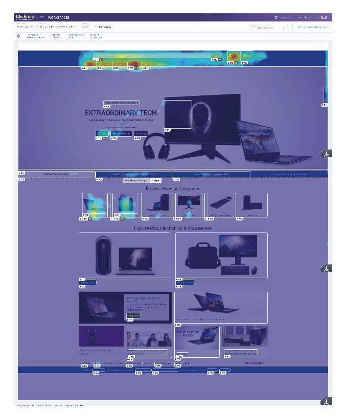
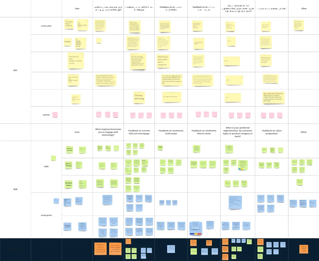
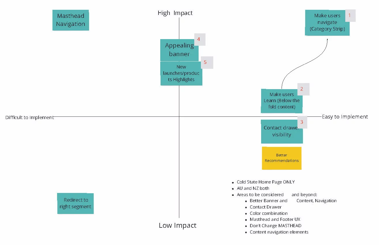
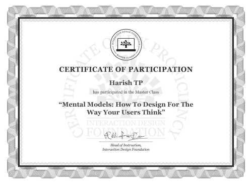
Certified Usability Analysts
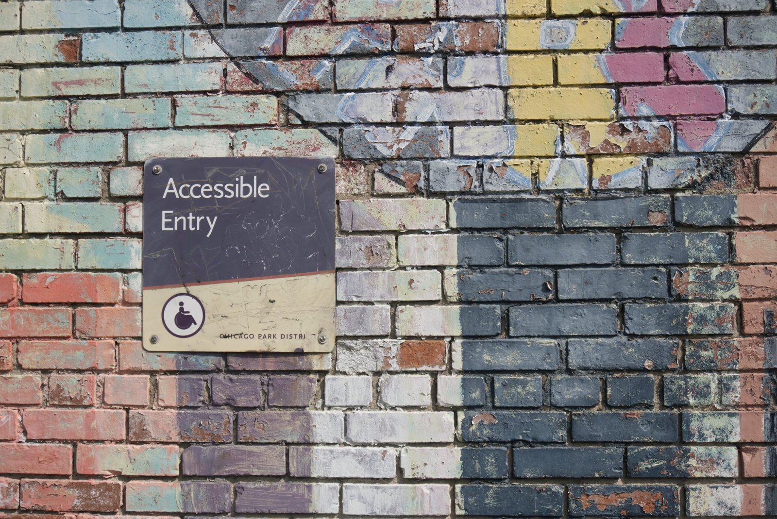
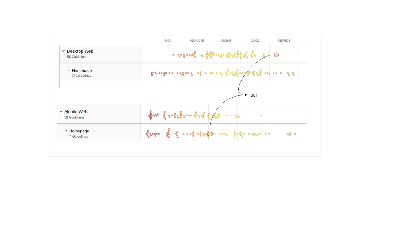
ACE level 1 and 2 accessibility certification from Dell Technology
Education
Human Factor International
Certified Usability Analyst( CUA™) HFI ( 2011)
Bachelor of Commerce
Mangalore University (2000)
Skill
User Research
Wireframing and Prototyping
Interaction Design
Usability Testing
User Testing
User-Centered Design
UI/UX Design
Team Leadership
Design Thinking
Stakeholder Collaboration
Tools
Sketch
Figma
UXPin
InVision
Adobe Creative Suite
AxureRP Pro
Balsamiq
Webflow
HTML and CSS
Testimonial
Pradeep Kumar
Social Media Expert at Hewlett Packard EnterpriseI had a chance to work with Harish for almost a year. He has a good designing skills. He would see a broader picture before starting the wireframe. He is a good asset to the team.
Patrick Tardif
Co-Founder of Coloromo.com and Founder of PasswordWrench. Top rated software architect and leader focusing on machine learning, big data, cyber security, AI algorithms and integrations with AR and VR.Harish helped us to design several portions of our site StoryOfMyLife.com.
Chandesh TK
Head of Design OnePlus (India Region)He is one guy you can look upon to get work done with the best result, great quality and on time every time. Dedication, talent and always want to be updated with the industry is what i have seen in him. He knows what he is working on.
Narendra Busi
Program Manager at Capgemini Technology Services Pvt LtdHarish is co-employee with-in organization. Worked many projects in co-ordination with him. He manages graphics, html conversion and client conversions and sometimes suggestions to client on the designs and get appreciated even. Just give him a concept line, he makes the total design and explains his work very well. He is basically good in-person and smart worker. Manages his team and be very support to his team in required places. Manages the team and the activities efficiently. Good in Photoshop graphics, HTML, CSS, Web 2.0 and every time striving to use new techniques during his work and tries to implement them in smart way!
Blog
The Power of Design Systems: Elevating Your Next Design
Why Design Systems Are Essential for Your Next Design
When it comes to creating exceptional designs, consistency is key. And that’s where design systems come in. A design system is a collection of reusable components, guidelines, and assets that ensure uniformity and efficiency in your design process.
By implementing a design system, you can streamline your workflow, improve collaboration, and enhance the overall quality of your designs. Let’s explore the advantages of using a design system for your next project:
1. Consistency and Brand Identity
A design system acts as a central hub for all your design assets, ensuring that your brand identity remains consistent across various platforms and mediums. With predefined components and guidelines, you can effortlessly maintain a cohesive look and feel throughout your designs.
Whether it’s colors, typography, or button styles, a design system allows you to establish a strong brand identity and build trust among your audience. Consistency breeds familiarity, and by consistently delivering a visually appealing and cohesive user experience, you can strengthen your brand and leave a lasting impression.
2. Efficiency and Time Savings
A design system accelerates your design process by providing pre-built components that you can reuse across different projects. Instead of starting from scratch every time, you can simply grab these components and customize them according to your specific needs.
Not only does this save time, but it also promotes consistency and eliminates the risk of errors. With a design system, you no longer have to waste hours recreating the same elements. Instead, you can focus on the creative aspects of your design and deliver high-quality work in a shorter span of time.
3. Collaboration and Scalability
Design systems foster collaboration among designers, developers, and stakeholders. By having a centralized system, everyone involved in the design process can access the same components, guidelines, and documentation. This promotes a shared understanding and facilitates better communication.
Moreover, a design system allows for easy scalability. As your business grows and evolves, you can continue to expand and refine your design system to meet new requirements. This ensures that your designs remain adaptable and maintain their high standards, even as you take on more complex projects.
Unlock the Potential of Design Systems Today
Design systems are no longer just a trend but a necessity in the design industry. They bring cohesiveness, efficiency, and scalability to your design process, ensuring that your next project is a success. So, why wait? Start harnessing the power of design systems and take your designs to new heights!
5 Must-Have Figma Plugins to Supercharge Your UX Design Workflow
Streamline Your UX Design Workflow with these Handy Figma Plugins
As a UX designer, you’re constantly seeking ways to boost your productivity and efficiency. Figma, the popular design tool, offers a wide range of plugins that can help you streamline your design process and create stunning user experiences. In this blog post, we’ll explore five must-have Figma plugins that can automate and enhance your UX design workflow.
1. Stark
Ensuring your design is accessible to all users is crucial in UX design. Stark, a Figma plugin, helps you check the contrast ratio of your design elements, ensuring they meet accessibility standards. It also provides colorblind simulation to help you understand how your design appears to users with color vision deficiency. With Stark, you can create inclusive designs that cater to a diverse user base.
2. Content Reel
Content creation is an essential part of UX design, and the Content Reel plugin helps you streamline this process. It allows you to import and manage real content directly within Figma, eliminating the need to switch between different tools. With Content Reel, you can quickly populate your designs with realistic text and images, saving you valuable time and effort.
3. Auto Layout
Designing responsive interfaces can be a time-consuming task. Auto Layout, a powerful Figma plugin, simplifies this process by automatically adjusting the position and size of elements based on their constraints. It enables you to create dynamic and flexible designs that adapt to different screen sizes effortlessly. With Auto Layout, you can speed up your design iterations and ensure consistency across multiple devices.
4. Neumorphism
If you’re a fan of the popular neumorphic design trend, the Neumorphism plugin is a must-have. It allows you to easily create neumorphic elements within Figma, saving you the hassle of manually creating shadows and gradients. With Neumorphism, you can quickly add depth and realism to your designs, giving them a modern and visually appealing look.
5. Iconify
Icons play a crucial role in UX design, and the Iconify plugin simplifies the process of finding and using icons within Figma. It provides access to a vast library of high-quality icons from popular icon sets like FontAwesome and Material Design Icons. With Iconify, you can quickly search for and insert icons into your designs, saving you time and ensuring consistency in your visual language.
Enhance Your UX Design Workflow with Figma Plugins
These five Figma plugins are invaluable tools for any UX designer looking to automate and enhance their design process. From ensuring accessibility and streamlining content creation to simplifying responsive design and adding depth to your visuals, these plugins offer a range of features that can supercharge your workflow. Give them a try and experience the power of Figma plugins firsthand!
Boost Your Productivity with the Top 5 Figma Plugins Powered by AI
Introduction
Welcome to the future of design! In this blog post, we will uncover the top 5 Figma plugins that utilize the power of Artificial Intelligence (AI) to supercharge your workflow. Gone are the days of spending countless hours on repetitive tasks and mundane design elements. With these innovative plugins, you’ll be able to fasten your work and skyrocket your productivity to new heights.
1. Magic Layouts
First up on our list is Magic Layouts, the ultimate time-saving plugin for Figma users. This plugin leverages AI to automatically generate responsive designs, making it a breeze to create designs for different screen sizes. Say goodbye to manually adjusting layouts for mobile, tablet, and desktop – Magic Layouts does it all for you!
By simply selecting your desired screen size, Magic Layouts intelligently adjusts your design elements to fit perfectly. This plugin even offers smart suggestions for grid systems and breakpoints, giving you a head start on creating stunning and user-friendly designs.
2. Auto-Layouter
If you’re tired of resizing and rearranging elements manually, Auto-Layouter is here to revolutionize your design process. Powered by AI, this plugin automatically organizes your design elements based on predefined rules, saving you valuable time and effort.
With Auto-Layouter, you can easily create dynamic interfaces that adapt to different content lengths or changing user requirements. This plugin takes care of the heavy lifting, allowing you to focus on the creative aspects of your design.
3. Smart Selection
Say goodbye to tedious manual selection with Smart Selection – the plugin that brings AI-powered magic to your Figma workspace. This intelligent tool analyzes your design and suggests similar components or elements based on your selection.
Whether you’re looking to quickly identify and update all instances of a specific component or find visually similar elements across your project, Smart Selection has got you covered. It’s like having a personal assistant that helps you navigate through your design effortlessly.
4. Color Palette Generator
Choosing the perfect color palette can be a time-consuming task. Thankfully, Color Palette Generator is here to simplify the process. Powered by AI, this plugin analyzes your design and generates harmonious color palettes in an instant.
Simply select a base color, and Color Palette Generator will suggest complementary colors, shades, and tints for a professionally balanced design. With this plugin, you can explore endless color possibilities effortlessly, saving you both time and the headache of color theory.
5. Content Replacer
The Content Replacer plugin is a game-changer for designers working with dynamic content. Instead of manually replacing text and images across your designs, this AI-driven plugin automates the process.
Simply define your content placeholders, specify the new content, and let Content Replacer work its magic. This plugin ensures consistency across your designs, making it a must-have for projects with frequently changing content.
Conclusion
The future of design is here, and it’s powered by AI. With the top 5 Figma plugins we’ve explored, you can now streamline your workflow, eliminate tedious tasks, and focus on what truly matters – creating exceptional designs. So go ahead, embrace the power of AI and experience a new level of productivity in your design journey!
The Importance of Accessibility in Websites and Products
Accessibility is a crucial aspect of any website or product, as it ensures that everyone, regardless of their abilities or disabilities, can access and use it effortlessly. Here are five main reasons why accessibility is so important:
1. Inclusive Design: Accessibility allows for inclusive design, which means creating websites and products that can be used by a diverse range of individuals. By considering the needs of people with disabilities, you can make your website or product more user-friendly for everyone.
2. Legal Compliance: Many countries have laws and regulations that require websites and products to be accessible to people with disabilities. By ensuring accessibility, you can avoid legal issues and potential penalties.
3. Increased Reach: By making your website or product accessible, you can reach a larger audience. There are millions of people with disabilities worldwide, and by catering to their needs, you can tap into a significant market segment.
4. Better User Experience: Accessible websites and products provide a better user experience for all users. Features like text alternatives for images, clear navigation, and adjustable font sizes benefit everyone, not just people with disabilities.
5. Brand Reputation: Demonstrating a commitment to accessibility can enhance your brand’s reputation. Customers appreciate businesses that prioritize inclusivity and are more likely to support and recommend them.
10 Main Reasons to Have Senior Designers in the Team
Having senior designers on your team can greatly benefit your organization in numerous ways. These experienced professionals bring a wealth of knowledge and skills that can enhance the overall design process and contribute to the success of your projects. Here are 10 main reasons why having senior designers in your team is essential:
- Expertise and Experience: Senior designers have years of experience in the field, which allows them to provide valuable insights and guidance to the team. Their expertise helps in making informed design decisions and avoiding common pitfalls.
- Leadership: Senior designers have the ability to lead and mentor junior designers. They can guide the team by setting design standards, providing feedback, and ensuring that projects are executed efficiently.
- Problem Solving: Senior designers excel in problem-solving. They can identify design challenges and come up with innovative solutions that meet both user needs and business goals.
- User-Centric Approach: Senior designers understand the importance of putting users at the center of the design process. They have the skills to conduct user research, gather insights, and create designs that address user needs effectively.
- Quality Assurance: Senior designers have an eye for detail and can ensure that the final product meets high-quality standards. They can conduct thorough design reviews, identify areas for improvement, and ensure consistency across different design elements.
- Efficiency: With their experience, senior designers can work more efficiently and effectively. They can streamline the design process, optimize workflows, and deliver high-quality designs within tight timelines.
- Collaboration: Senior designers are excellent collaborators. They can effectively communicate their ideas, provide constructive feedback, and work seamlessly with other team members, such as developers and product managers.
- Industry Knowledge: Senior designers stay up to date with the latest design trends, tools, and techniques. Their knowledge can help your organization stay competitive and ensure that your designs are modern and relevant.
- Client Relationships: Senior designers have the skills to build strong relationships with clients. They can effectively communicate design concepts, manage client expectations, and ensure client satisfaction throughout the design process.
- Mentorship: Senior designers can play a crucial role in the growth and development of junior designers. They can provide guidance, share their expertise, and help junior designers enhance their skills and knowledge.
Having senior designers in your team is essential for the success of your projects. Their expertise, leadership, problem-solving skills, and user-centric approach can greatly contribute to the quality and effectiveness of your designs. Furthermore, their efficiency, collaboration, industry knowledge, client relationships, and mentorship capabilities make them invaluable assets to any design team.
Understanding Color Theory in UX/UI Design
Color plays a vital role in user experience (UX) and user interface (UI) design. It has the power to convey emotions, establish brand identity, and guide user interactions. To create visually appealing and user-friendly designs, it is essential to understand the basic principles of color theory. In this blog post, we will explore four key concepts of color theory in UX/UI design, along with relevant examples.
1. Color Wheel
The color wheel is a fundamental tool in understanding color relationships. It consists of primary colors (red, blue, and yellow), secondary colors (orange, green, and violet), and tertiary colors (a mix of primary and secondary colors). By leveraging the color wheel, designers can create harmonious color palettes that complement each other.
2. Color Harmony
Color harmony refers to the pleasing combination of colors in a design. There are different types of color harmonies, such as complementary, analogous, and triadic. Complementary colors are opposite to each other on the color wheel, creating high contrast and visual impact. Analogous colors are adjacent to each other, resulting in a harmonious and serene feel. Triadic colors are evenly spaced on the color wheel, offering a vibrant and balanced palette.
3. Color Contrast
Color contrast is crucial for ensuring readability and accessibility in UX/UI design. It involves the juxtaposition of light and dark colors to enhance visibility and legibility. Designers need to consider contrast ratios between background and text colors to meet accessibility standards. A high contrast ratio ensures that users with visual impairments can easily read the content.
4. Color Psychology
Colors have psychological associations and can influence user perceptions and behaviors. For example, blue is often associated with trust and dependability, making it suitable for financial institutions. Red is associated with energy and excitement, which can be used to draw attention or create a sense of urgency. Understanding color psychology helps designers evoke specific emotions and responses from users.
By leveraging these four color theory concepts, UX/UI designers can create visually appealing and user-friendly interfaces. Understanding the relationships between colors, creating harmonious palettes, considering contrast, and utilizing color psychology will elevate the overall user experience and enhance the impact of the design.
The Evolution of E-Commerce: From Brand-led to UX-led in the 1990s and 2020s
In the world of e-commerce, the 1990s marked the beginning of a new era. Brand-led e-commerce was the norm back then. Companies focused on establishing their brand identity and creating a strong online presence. This involved building visually appealing websites, showcasing their products, and providing basic functionalities for customers to make purchases.
Fast forward to the 2020s, and the landscape of e-commerce has drastically changed. With the rise of user experience (UX) design and technology advancements, UX-led e-commerce has taken center stage. The focus has shifted from just presenting a brand to creating an immersive and personalized shopping experience for customers.
So, what exactly is the difference between brand-led e-commerce in the 1990s and UX-led e-commerce in the 2020s? Let’s delve into the details.
Brand-led E-Commerce in the 1990s
In the 1990s, e-commerce was still in its infancy. Companies primarily used their websites as digital catalogs, where customers could browse through products and place orders. The emphasis was on creating a visually appealing website that reflected the brand’s identity.
However, the functionality of these websites was often limited. Customers had to navigate through multiple pages to find what they were looking for, and the checkout process was often cumbersome and time-consuming.
Additionally, personalization was minimal, if not non-existent. Websites offered a one-size-fits-all experience, with little regard for individual customer preferences or browsing habits.
UX-led E-Commerce in the 2020s
Fast forward to the 2020s, and UX-led e-commerce has revolutionized the online shopping experience. UX designers now play a crucial role in creating seamless, intuitive, and personalized user journeys.
Today’s e-commerce websites are optimized for mobile devices, ensuring a seamless shopping experience across different screens and platforms. Navigation has become more intuitive, with streamlined menus and search functionalities that enable customers to find products with ease.
Moreover, personalization has become a key focus. Advanced algorithms and machine learning technologies analyze customer data to offer tailored recommendations, personalized product suggestions, and customized shopping experiences.
What Does the Future Hold?
The future of e-commerce is undoubtedly exciting. As technology continues to advance, we can expect further enhancements in the user experience. Virtual reality (VR) and augmented reality (AR) technologies are already making their way into the e-commerce industry, enabling customers to virtually try on products and visualize them in their own living spaces.
Furthermore, voice commerce and artificial intelligence (AI) are set to play significant roles in the future of e-commerce. Voice assistants like Amazon’s Alexa and Google Assistant are already gaining popularity, allowing customers to make purchases using voice commands.
As for AI, it will continue to power personalized shopping experiences, providing real-time product recommendations, chatbot assistance, and enhanced customer support.
In conclusion, the shift from brand-led e-commerce in the 1990s to UX-led e-commerce in the 2020s signifies a significant evolution in the online shopping experience. With advancements in technology and a focus on user-centric design, the future of e-commerce holds endless possibilities for creating immersive, personalized, and seamless shopping experiences for customers.
The Importance of Accessibility in Web Design
Accessibility in web design is the practice of ensuring that websites and web applications are accessible to all users, regardless of their disabilities or limitations. It is crucial for businesses and organizations to prioritize accessibility because it not only helps them reach a wider audience but also promotes inclusivity and equal access to information.
One of the main implications of not following accessibility guidelines is that it can exclude individuals with disabilities from accessing and using websites effectively. For example, individuals with visual impairments may rely on screen readers to navigate websites. If a website is not properly designed with accessible features, the screen reader may not be able to interpret the content correctly, making it impossible for these users to access the information.
Another implication of ignoring accessibility is the potential legal consequences. Many countries have enacted accessibility laws and regulations that require businesses to make their websites accessible. Failure to comply with these laws can result in lawsuits, financial penalties, and damaged reputation.
Furthermore, inaccessible websites can lead to a negative user experience for all users. Non-accessible websites may have usability issues, such as poor navigation or unclear instructions, which can frustrate users and discourage them from engaging with the website or making a purchase.
By prioritizing accessibility, businesses can create a positive user experience for all users, regardless of their abilities. Implementing accessibility features such as alternative text for images, proper heading structure, and keyboard navigation not only helps individuals with disabilities but also benefits other users, such as those using mobile devices or slow internet connections.
In conclusion, accessibility in web design is essential for creating an inclusive digital environment. Ignoring accessibility guidelines can have serious implications, including exclusion of individuals with disabilities, legal consequences, and a negative user experience. By prioritizing accessibility, businesses can reach a wider audience, comply with legal requirements, and provide a better user experience for all users.
Using Generative AI in UX Design: Enhancing User Experience with Artificial Intelligence
Introduction
Artificial intelligence (AI) has revolutionized various industries, and UX design is no exception. With the emergence of generative AI, designers now have a powerful tool at their disposal to enhance user experience in ways never thought possible before. Generative AI allows designers to create dynamic and personalized experiences for users, ensuring that every interaction is tailored to their needs and preferences.
What is Generative AI?
Generative AI is a subset of artificial intelligence that focuses on creating new and unique content based on patterns and data inputs. It uses machine learning algorithms to analyze existing data and generate new outputs that mimic human creativity. In the context of UX design, generative AI can be used to automate various design tasks, such as generating layouts, creating color palettes, and even designing interactive elements.
How to Use Generative AI in UX Design
1. Automated Layout Generation
One of the most time-consuming tasks in UX design is creating layouts for websites and applications. With generative AI, designers can automate this process by training algorithms on existing layouts and enabling them to generate new layouts based on user requirements. This not only saves time but also ensures consistency and coherence in design across different platforms.
2. Personalized Experiences
Generative AI enables designers to create personalized experiences by analyzing user data and generating content that is tailored to individual preferences. By understanding user behavior, AI algorithms can recommend personalized content, adapt interfaces, and even predict user actions, resulting in a highly customized user experience.
3. Interactive Design Elements
With generative AI, designers can go beyond static design elements and create interactive and dynamic interfaces. AI algorithms can generate animations, transitions, and micro-interactions that respond to user interactions, providing a more engaging and immersive user experience. This level of interactivity enhances the overall usability and delightfulness of the design.
Best Tools for Generative AI in UX Design
While there are several tools available for generative AI in UX design, here are a few of the best ones:
- Figma’s Design Lint: Figma’s Design Lint uses generative AI to analyze design files and provide real-time feedback on design best practices, accessibility, and usability. It helps designers create more inclusive and user-friendly designs.
- Runway ML: Runway ML is a powerful tool that allows designers to experiment with generative AI models and integrate them into their design workflows. It provides a user-friendly interface and a wide range of pre-trained models for designers to explore.
- Sketch2React: Sketch2React uses generative AI to convert design files into production-ready code, reducing the time and effort required for developers to implement designs. It streamlines the design-to-development process and ensures design consistency.
Conclusion
Generative AI has opened up new possibilities in UX design, empowering designers to create highly personalized and engaging experiences for users. By leveraging the power of AI algorithms, designers can automate repetitive tasks, personalize content, and create interactive design elements. With the right tools and a deep understanding of user needs, generative AI can elevate user experience to new heights.


