Portfolio website of Harish T P
Case Studies
- Home
- Case Studies
Click to View
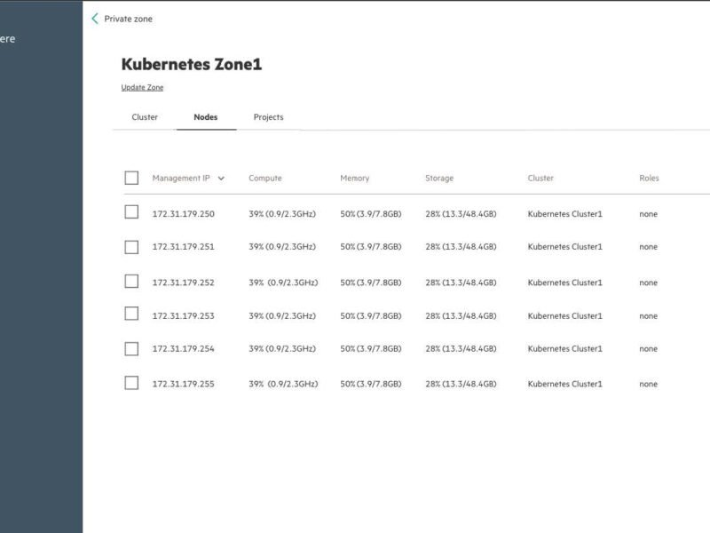
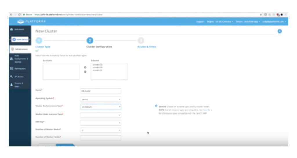
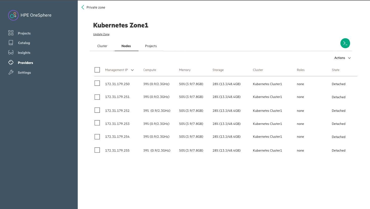
HPE OneSphere: Simplifying Kubernetes Onboarding on Bare-Metal
From 6 minutes → 2 minutes in onboarding time
Your Role: Lead UX Designer (Research → Prototyping → Testing → Final Design)
Overview
HPE OneSphere is Hewlett Packard Enterprise’s cloud management platform, designed to simplify hybrid cloud management—spanning on-premises infrastructure and public/private clouds.
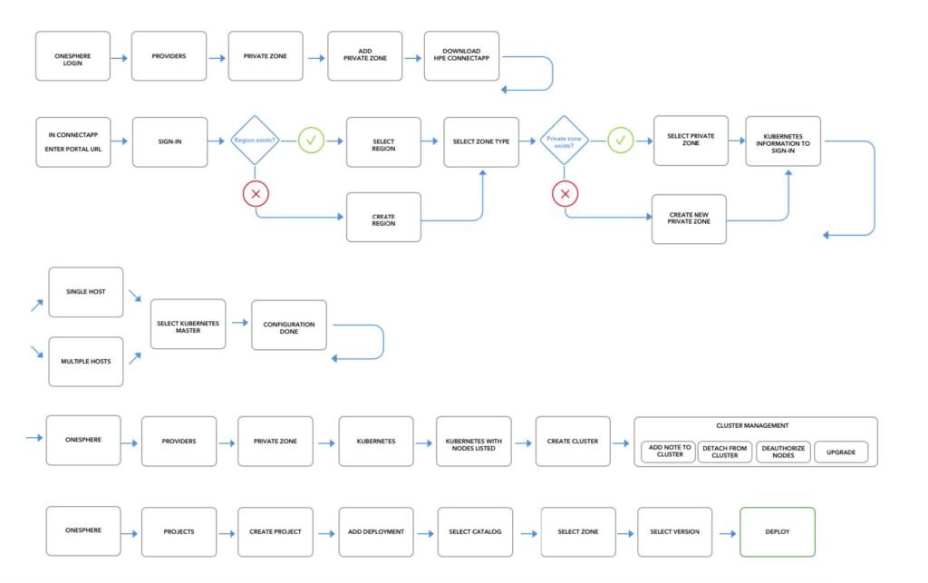
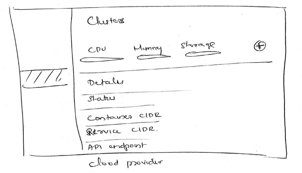
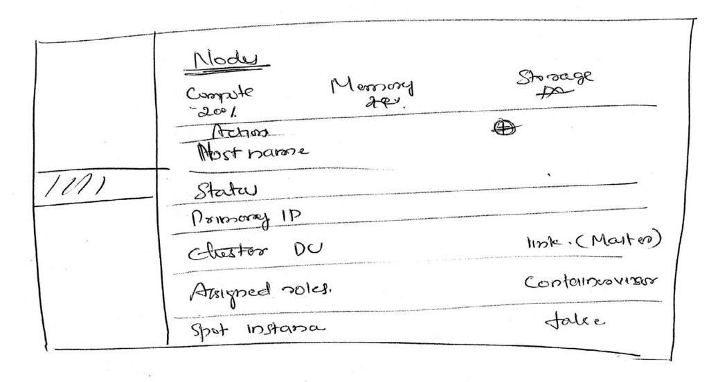
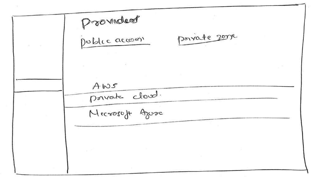
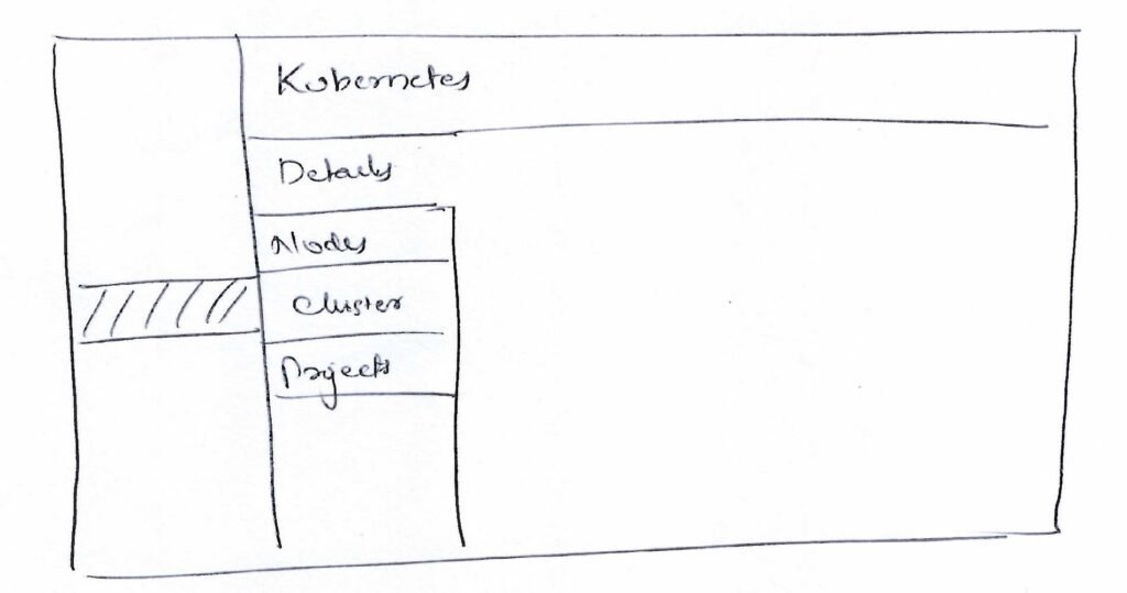
In this project, the focus was on a critical pain point: onboarding Kubernetes clusters on bare-metal servers. The process was manual, complex, and prone to errors, causing delays and limiting adoption.
The Challenge`
“Onboarding Kubernetes on bare-metal was too complex.”
Complex: too many manual steps
Unclear: master nodes not easily identified
Time-consuming: ~6 minutes, error-prone
Project Goal
Statement: Simplify Kubernetes onboarding → faster, transparent, and error-free.
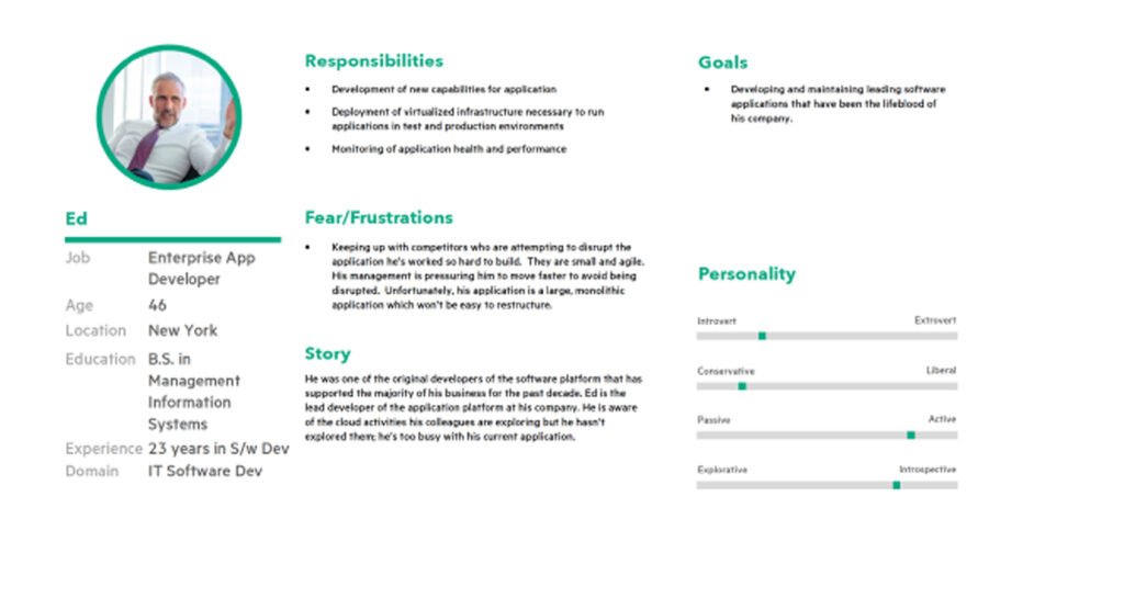
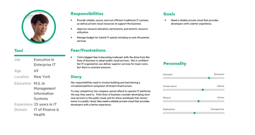
My Role
- UX Research & Persona Refinement
- Competitive Analysis
- Task Flow Mapping
- Wireframing & Prototyping
- User Testing (Preference, Moderated, A/B)
- Final UI Design
Research & Insights
Method
Stakeholder interviews, user interviews, competitor benchmarking
Insight
Competitors (VMware Tanzu, RedHat OpenShift, GKE, etc.) automated flows, while OneSphere felt manual and unclear.
Competitive Analysis


Persona
Task flow
Previous flow: Multiple manual steps → error-prone.
New flow: Automated node attachment + clear master node designation.
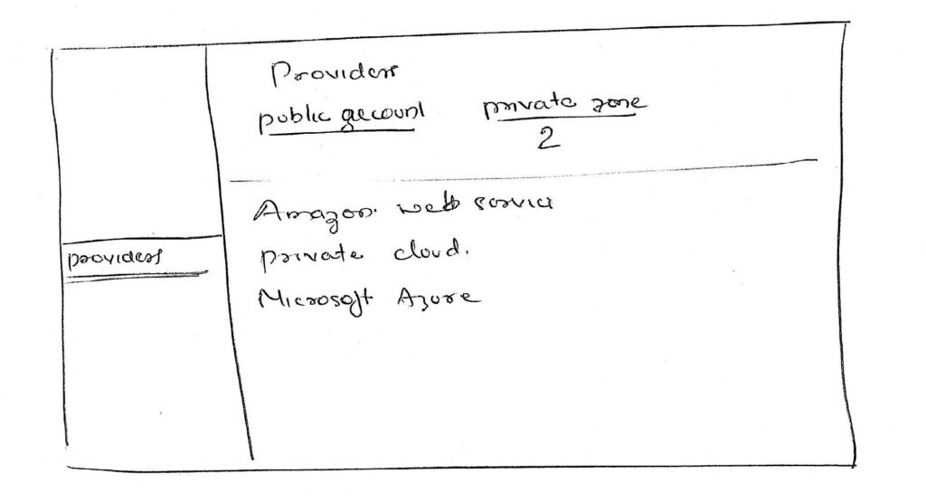
Wireframes & Testing
Process
Preference testing (which design do users prefer?)
Moderated testing (can users complete the task?)
A/B testing (compare iterations)
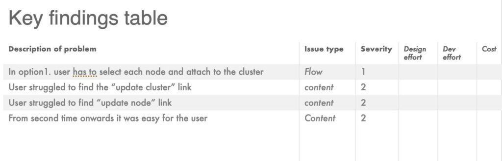
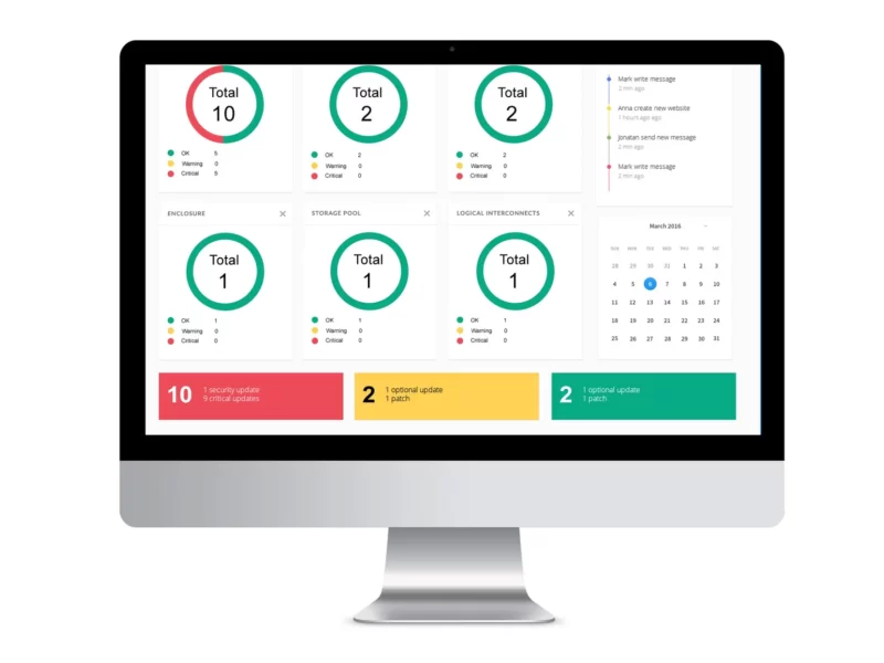
User Stats
- 25 users tested
- 23 found it easiest
- 2 users confused about master nodes → improved with clearer role indicators


Users tested
0
Users felt its the easiest method
0
Users unable to find which nodes were master nodes
0
mintes to complete the task
0
Few Verbatiums from the test
Attaching nodes was relatively quick and easy. I had no issues with figuring out how to go about doing this.
I believe that this would be the absolute easiest way to attach nodes, It is quicker and much more efficient than the previous method.
I believe all three nodes were attached as a master node to the cluster. I could be wrong but this is what I can recall
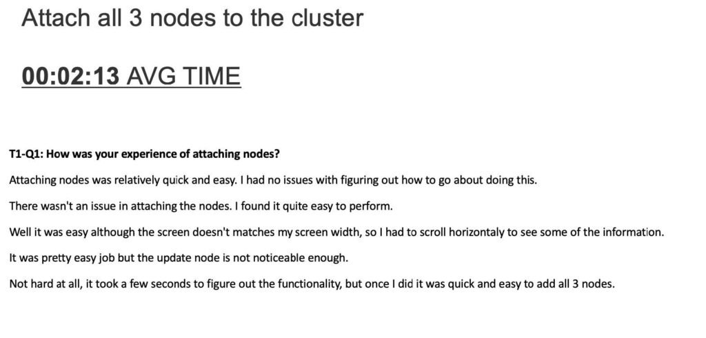

Even though the process was easy for the users, 2 users were unable to understand which node was attached as the master node. So we went back to the drawing board and made some changes to address that and tested it again.


Impact
Time savings: Reduced onboarding from ~6 min to ~2 min.
Confidence: 92% of tested users felt “easiest method yet.”
Adoption: Increased frequency of successful Kubernetes deployments.
Reflection
This project pushed me to:
Translate deeply technical workflows into simple, intuitive designs.
Balance automation with transparency, ensuring admins felt in control.
Leverage testing insights to iterate quickly and land on a solution that worked in the real world.
If I continued, I’d explore:
AI-driven recommendations for node assignment.
Deeper monitoring integration to further reduce admin effort.
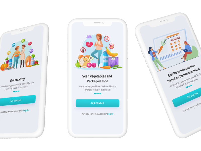
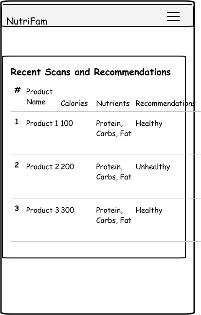
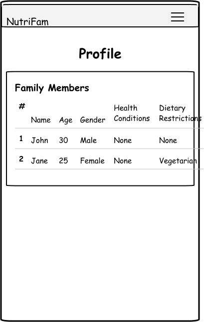
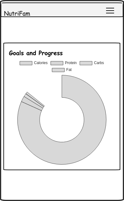
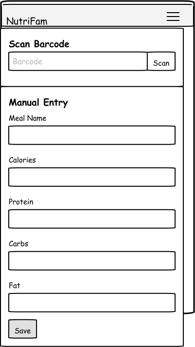
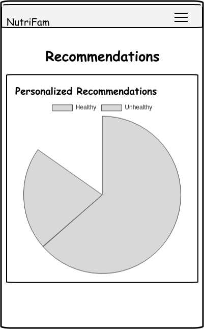
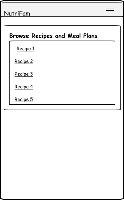
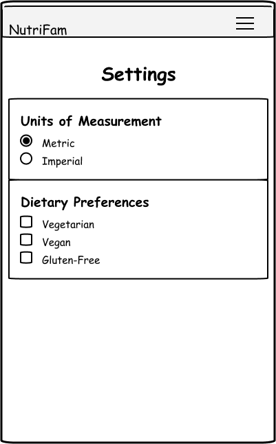
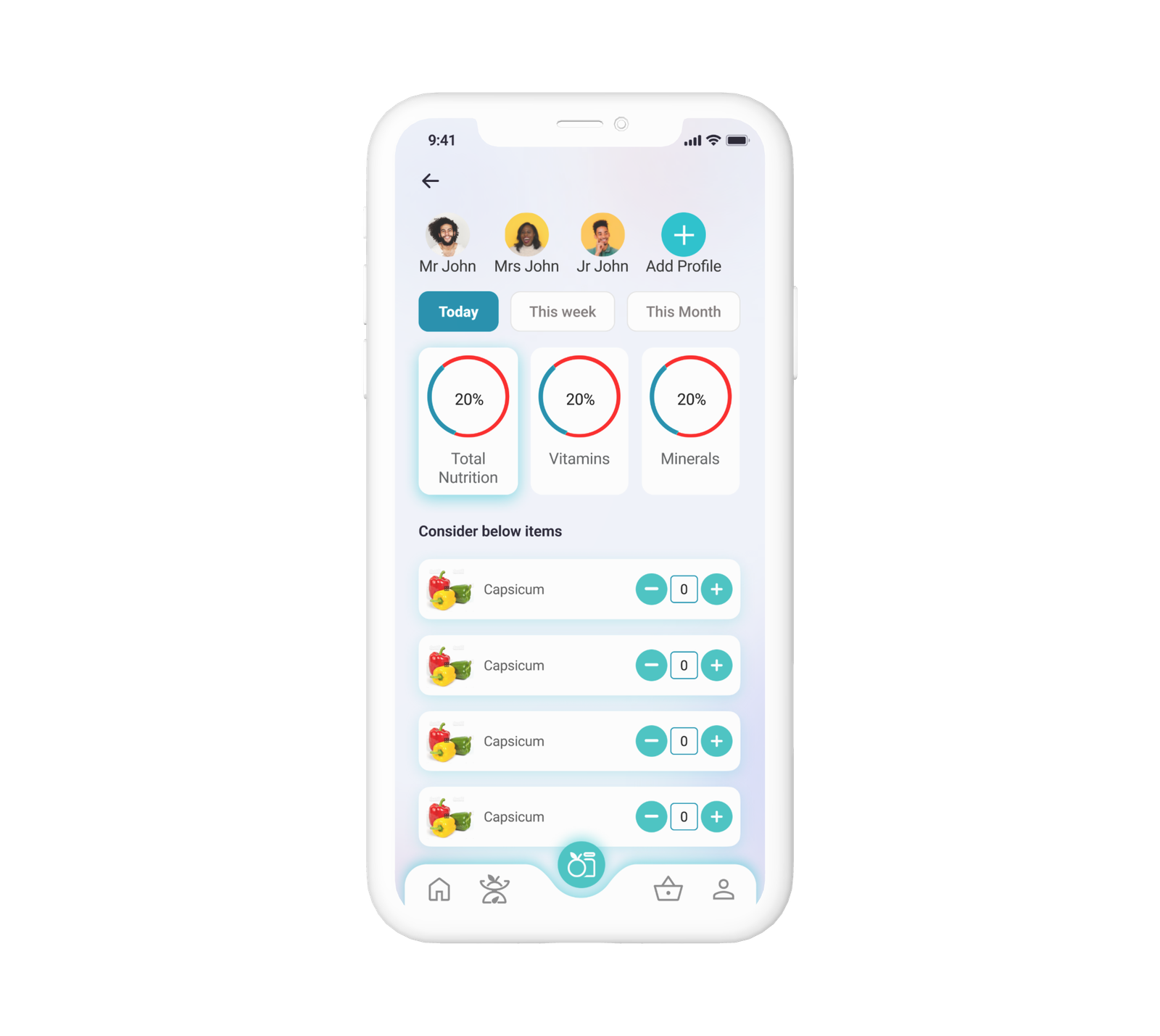
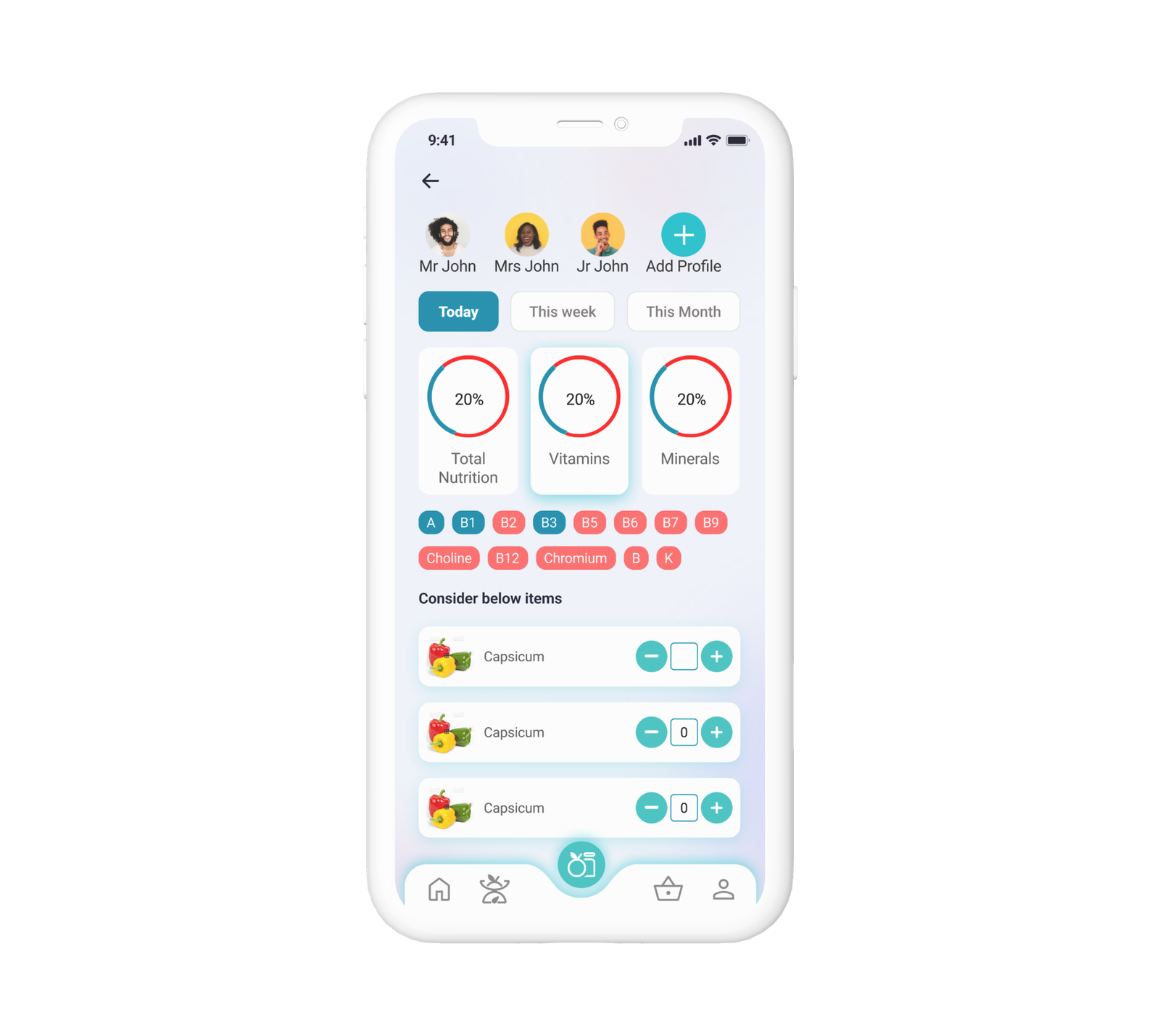
NutriGuide
Nutrition guide App to track the nutrition consumption by family based on the current health condition and purchase.
Project Overview
Revolutionize wellness with our cutting-edge nutrition app, delivering personalized dietary guidance and fostering a supportive community. Elevate health outcomes through data-driven recommendations, while driving engagement with features like personalized profiles, recipe sharing, and expert-endorsed advice. Transform user behaviors, optimize well-being, and establish credibility in the health-tech landscape
My Role
- Research
- User Interview
- Wireframe
- User Flow
- UI Design
Problem Statement
Develop a nutrition recommendation app that addresses the challenge of providing personalized and evidence-based dietary guidance to users. The app should consider individual health goals, dietary preferences, medical conditions, and lifestyle factors to offer tailored nutritional advice and meal plans. The aim is to empower users to make informed decisions about their diet, optimize their overall health, and work towards achieving their wellness objectives.
Objectives & Goals
Goal is to develop and launch a nutrition recommendation app that provides users with personalized dietary guidance, empowers them to make informed nutritional choices, and supports their journey towards improved health and well-being.
Our Process
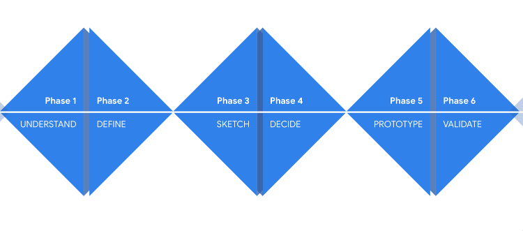
Process chart
Business Challenges
- Implementing a robust personalization system requires sophisticated algorithms and data processing, which can be technically challenging and resource-intensive.
- Maintaining a diverse and high-quality database of fruits vegetables and groceries and recommendations demands ongoing curation, testing, and updates to ensure user engagement and satisfaction.
- Sustaining user engagement beyond the initial excitement can be challenging
- Developing a monetization strategy that strikes a balance between offering valuable free features and enticing users to upgrade to premium
- Building partnerships with grocery shops for an easy purchase experience and partnerships with healthcare providers and professionals to refer users to the app
Quantitative Research
Sent out a survey to gather information about user expectations and also to understand what users are using and looking for.Received around 60 responses, below are some numbers from the survey
users currently seeking nutritional guidance
0
Primary health goal
0
has dietary restrictions
0
are comfortable with technology
0
motivation for diet improvement
0
are likely to use the app
0
Qualitative Research
"It's been really overwhelming, to be honest. There's so much conflicting information online, and I never know what to trust. I have specific health goals, but it's hard to find advice that fits my needs exactly."
"I have diabetes, and finding an app that considers my condition has been a challenge. I need something that not only helps me manage my blood sugar but also suggests meals that I'll actually enjoy."
"Personalization is key. Everyone is different, and I don't want a generic meal plan. It would be great if an app could take into account my allergies, food intolerances, and even cultural preferences."
"I often start off strong with a new diet, but then I get bored eating the same things. If an app could keep things interesting by suggesting a variety of meals and snacks, I'd be more likely to stick with it."
User Needs
- Users want an app that understands their uniqueness and provides recommendations that cater to their specific needs.
- User wants to trust that the app’s advice is backed by scientific research and endorsed by experts such as registered dietitians.
- User needs an app that offers convenient meal planning, easy-to-follow recipes, and streamlined grocery lists to simplify their dietary choices.
- Users want an app that keeps them engaged and motivated on their wellness journey
- The user wants an app that educates them about nutrition, helping them make informed decisions and empowering them to sustain healthy eating habits beyond the app.
Competitor Analysis
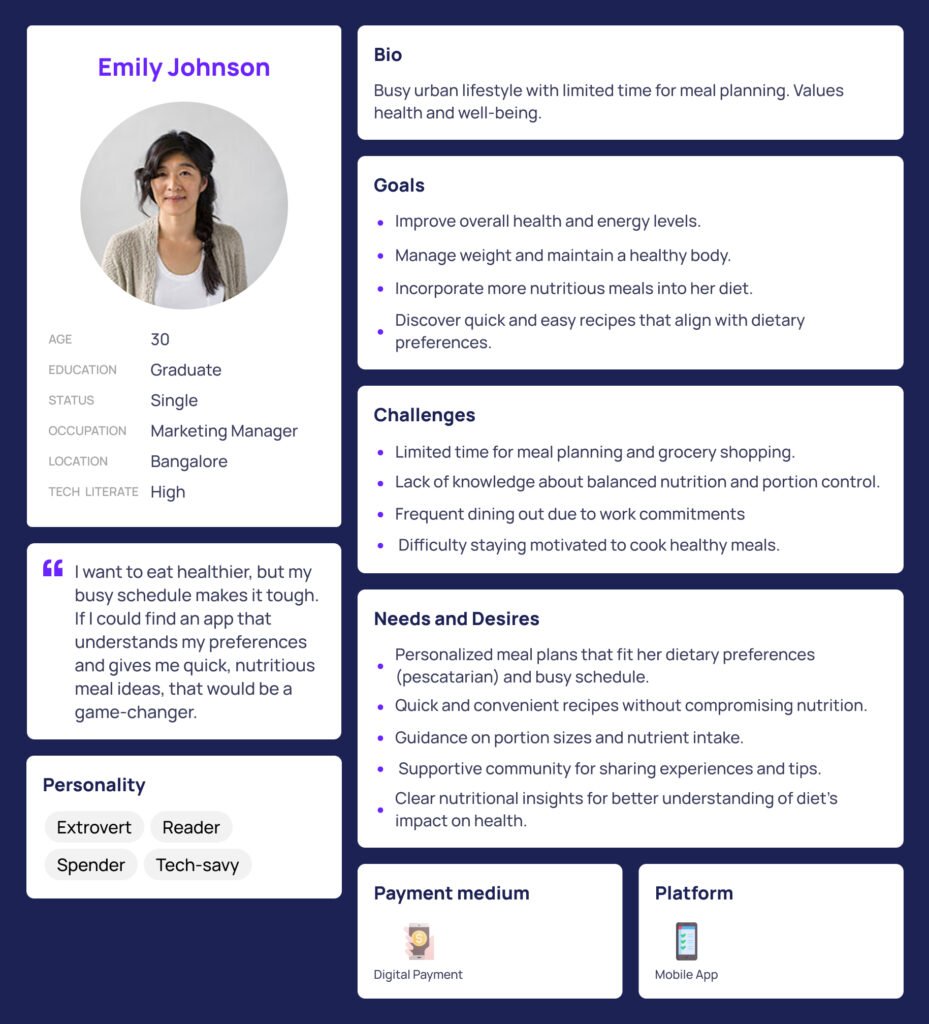
User Persona
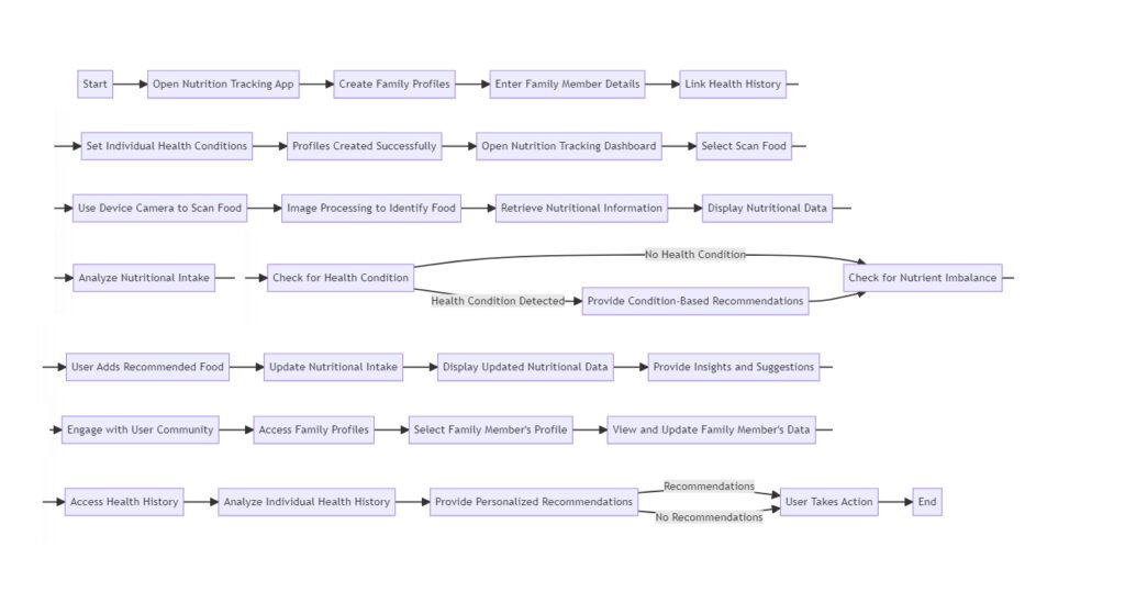
Task Flow
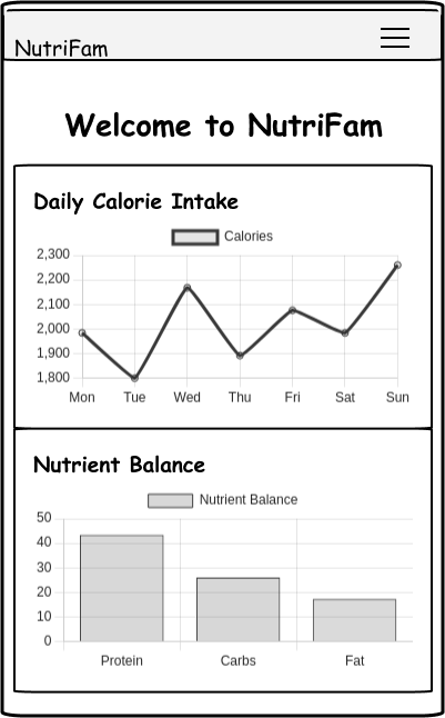
WireFrames
Final Designs
Here are a few final design options. These are not final designs, I am still exploring other options.


Implications
- The app could lead to heightened awareness among users about their family’s nutritional intake and health conditions. By providing insights and recommendations, users may make better-informed dietary choices, leading to improved overall health.
- The app’s ability to offer personalized recommendations based on individual health conditions can lead to tailored dietary plans.
- Families can collectively manage their nutritional goals and health conditions using a single platform.
- The app’s analysis of health history and nutritional intake can empower users to make more informed decisions about their eating habits.
Next Steps
- User Test the designs and make required changes
- Design detailed designs for each screens
- Partner with online grocery shops, and vegetable shops to find out if we can collaborate and deliver the items
- Partner with food bloggers to create customized recipes for the app user
- Create a community of app users, and other partners.
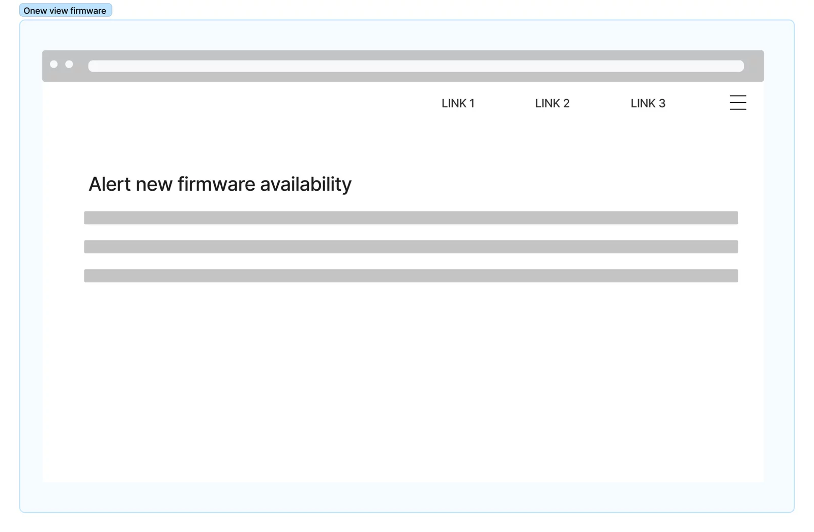
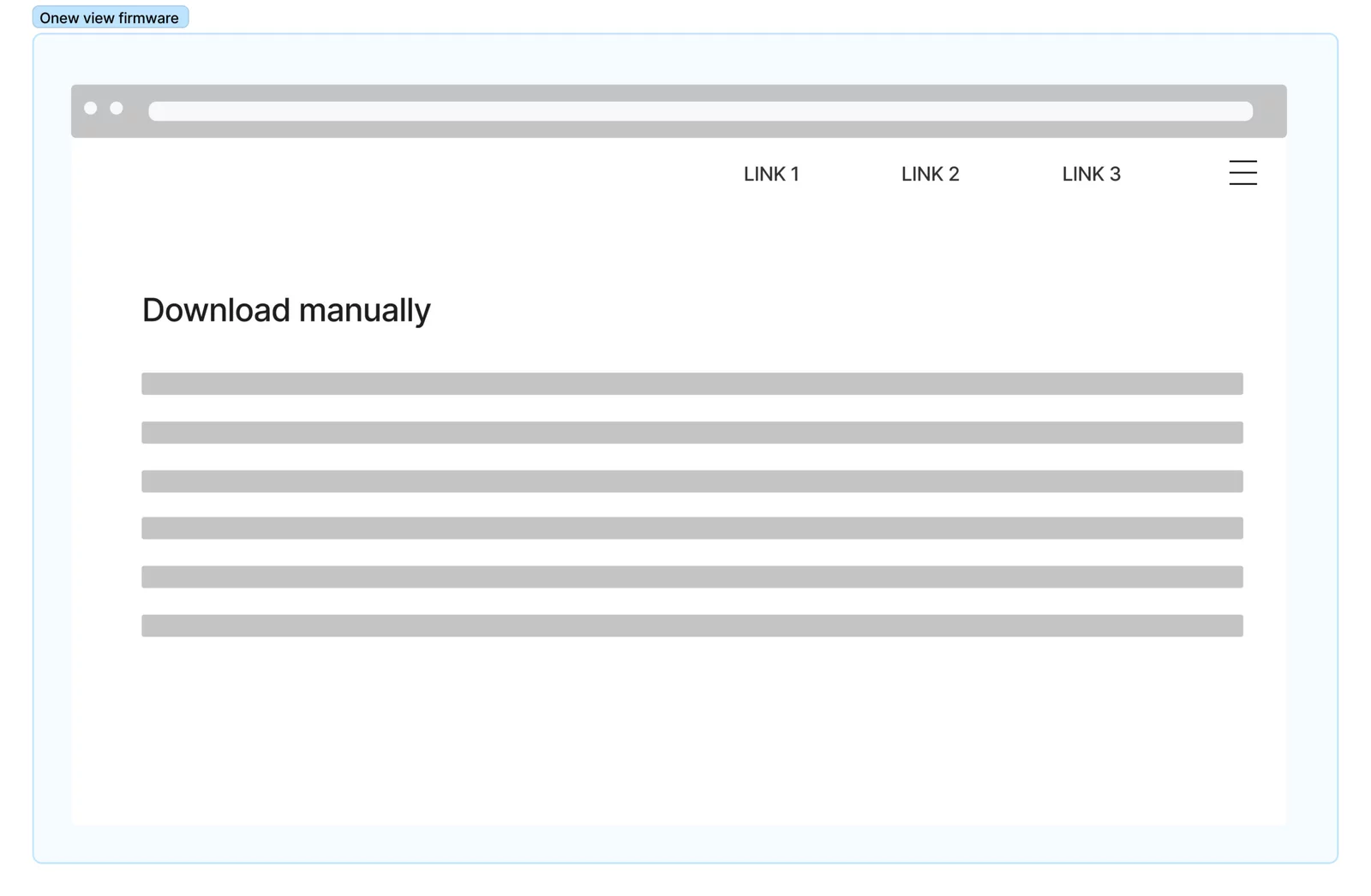
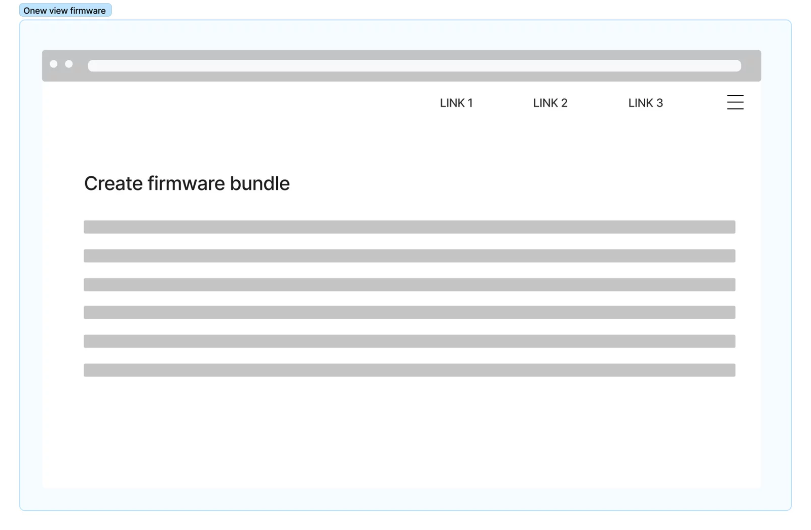
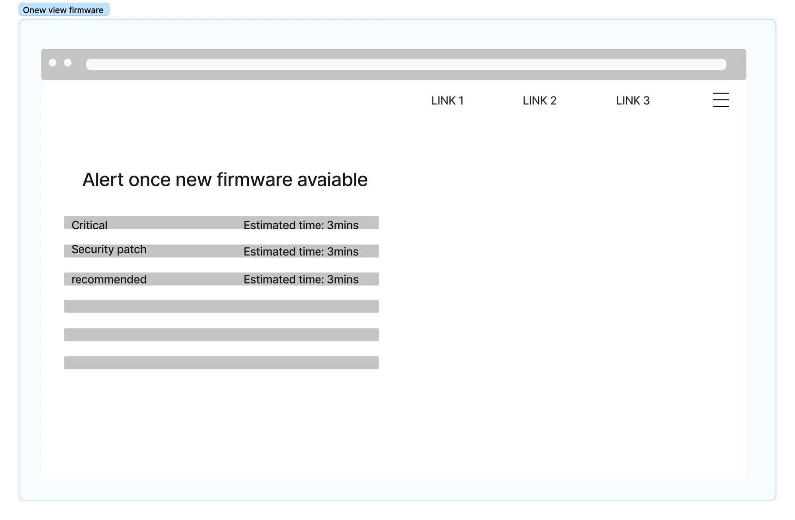
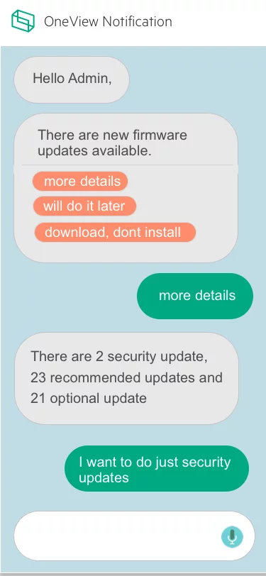
HPE OneView Firmware update
Impact
Improved confidence in firmware updates → Increased adoption and smoother IT operations.
Goal
Design a seamless, reliable, and low-friction firmware update experience that IT admins could trust and complete without hesitation.`
The Problem
Updating firmware in HPE OneView was a tedious and error-prone process.
IT admins lacked confidence in whether updates would complete successfully.
Downtime was unpredictable, often exceeding allowed maintenance windows.
Limited visibility into package size and available appliance space made updates risky.
As a result, many admins avoided updates altogether, leading to outdated systems and degraded performance.
My Role
- UX Designer
- Research
- Interviews
- Wireframing
- Task Flow
- Design
My Role
- Stakeholder & user interviews
- Persona refinement
- User journey mapping
- “How Might We” ideation & workshops
- Task flows & wireframes
- Final design
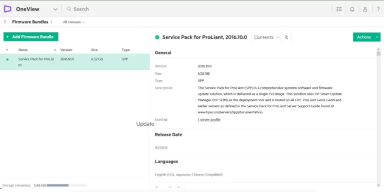
What is OneView
HPE OneView lets businesses simplify and automate today’s complex hybrid IT infrastructure. Through software-defined intelligence, HPE OneView takes a template-driven approach to deploying, provisioning, updating, and integrating compute, storage, and networking infrastructure. Designed with a modern, standards-based API, HPE OneView also helps users develop applications faster through integrations with a broad ecosystem of third-party management services and tools.
The Process

Research & Insights
I conducted stakeholder sessions and admin interviews to uncover pain points.
Key findings:
“No assurance the appliance won’t crash after an update.”
“We don’t know how long updates will take—it often exceeds downtime.”
“We can’t see package size or space requirements upfront.”
Admins constantly had to monitor for new critical updates manually.
These insights shaped the foundation for design opportunities.
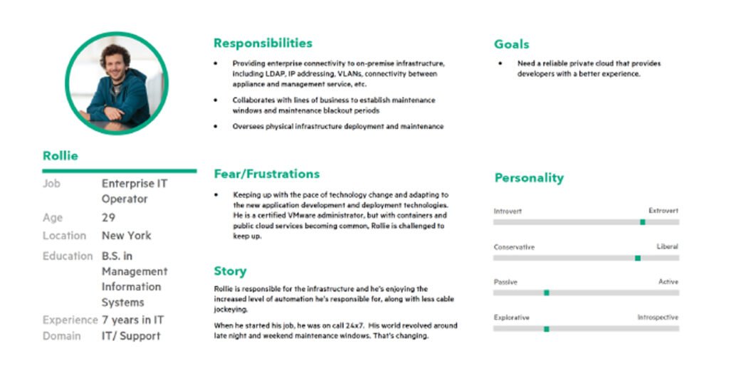
Persona & Journey Mapping
Since the existing personas didn’t cover my use case, I refined them to reflect IT admins focused on maintenance tasks.
I then created a journey map highlighting frustration points during each stage of the firmware update.

User Journey Map
After we came up with the persona, the next task I did was to create a user journey map for this particular use for this particular role

User Interivew
we collected a few end user feedback which we received during our interviews prior to my joining. Following were a few points.
- No assurance that the appliance will not crash after the firmware bundle
- we don’t know the time taken to do the update upfront. some time it will go beyond the downtime allowed.
- will not give the space needed in the appliance
Other key feedback recieved from the IT admin who is responsible for doing the firmware bndle.
- alwasy need to be alert and keep checking for any new critical update available in any hardware
- many times we will not know the package size
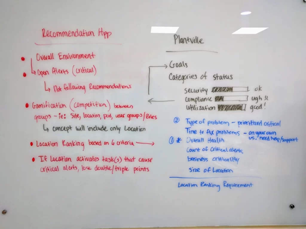
Design thinking workshop
Once after identifying the problems my task is to find as many possible solutions as possible. and validate the solutions by doing user testing and then take the best design for further design and development.
we got many different directions.
- make it gamification so that everyone can complete the firmware update in time.
- give points to each firmware update.
- user rating and reviews for each firmware bundle so that the one that is going to update will get confidence about the bundle
- and get the space needed for the bundle and available space in the appliance upfront prior to the update.

Design Opportunities (“How Might We”)
How might we build trust in the firmware update process?
How might we provide clarity upfront (time, space, risks)?
How might we make updates automatic and less reliant on user vigilance?
Ideation & Concept Exploration
During design thinking workshops, we explored different directions:
Gamification: Reward completion of updates (points, ratings, confidence indicators).
Transparency: Show required space, bundle size, estimated update time.
Community trust: Ratings/reviews per firmware bundle to build confidence.
Automation: Reduce manual steps and checks for admins.

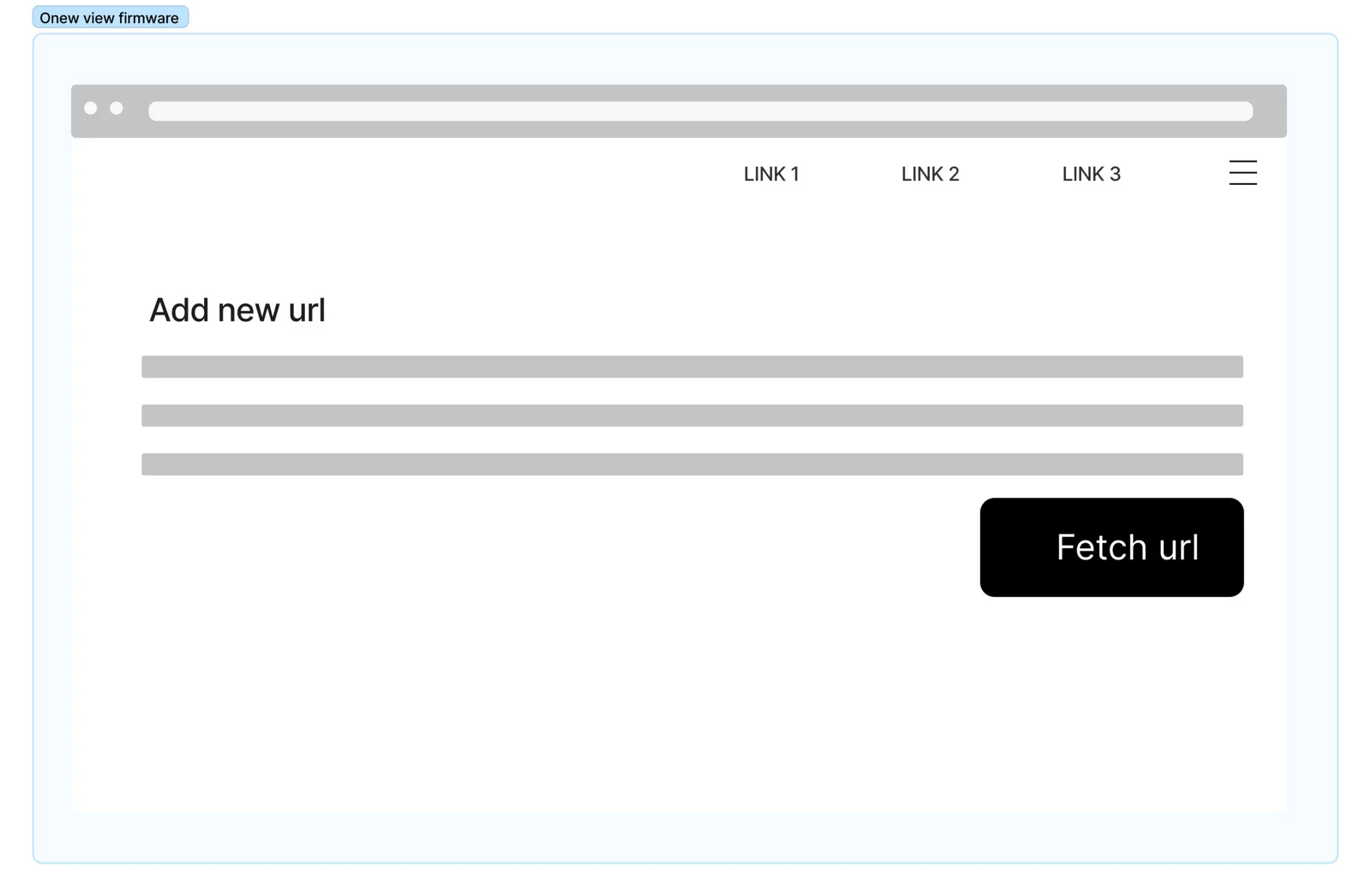


Task Flow & Wireframing
I created task flows and wireframes to validate solutions with users quickly.
Testing showed admins responded positively to:
Clear pre-update information (time, space, impact).
Simplified flows with fewer manual interventions.
Confidence indicators that improved trust in completing updates.
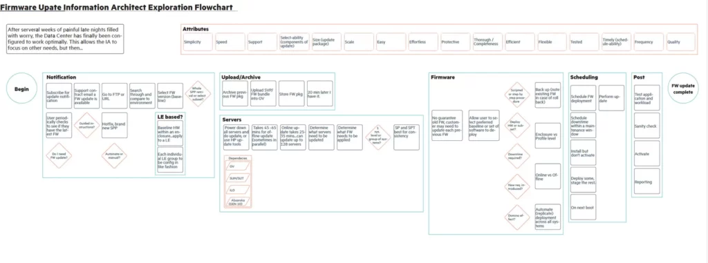
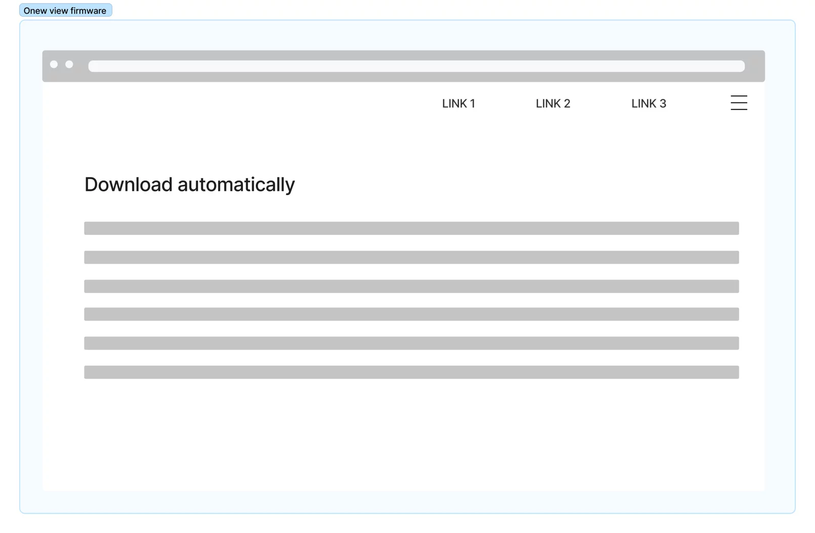
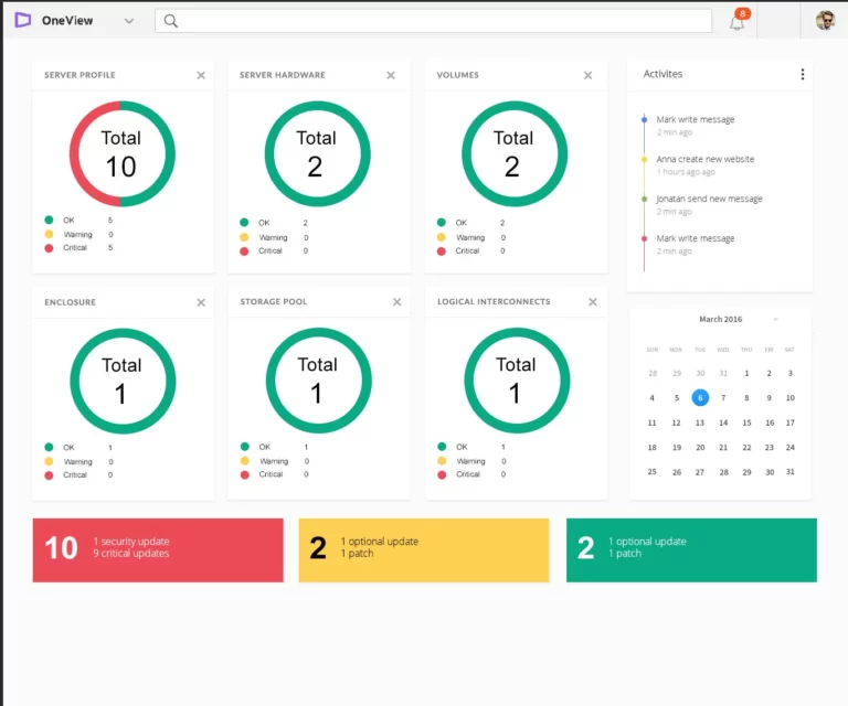
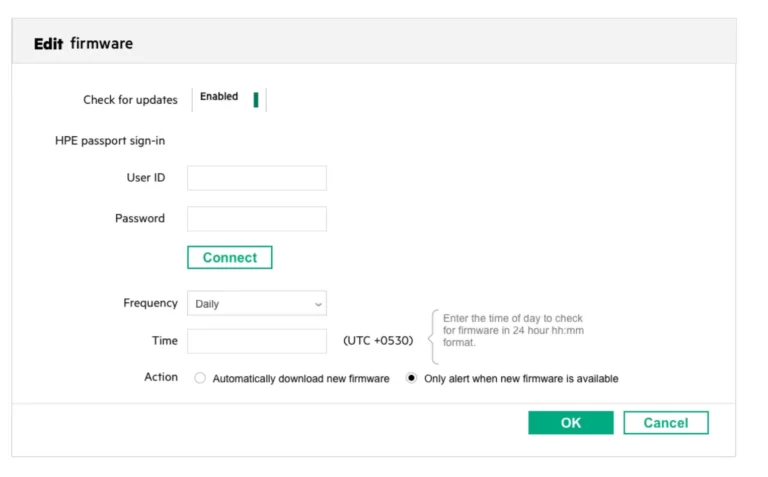
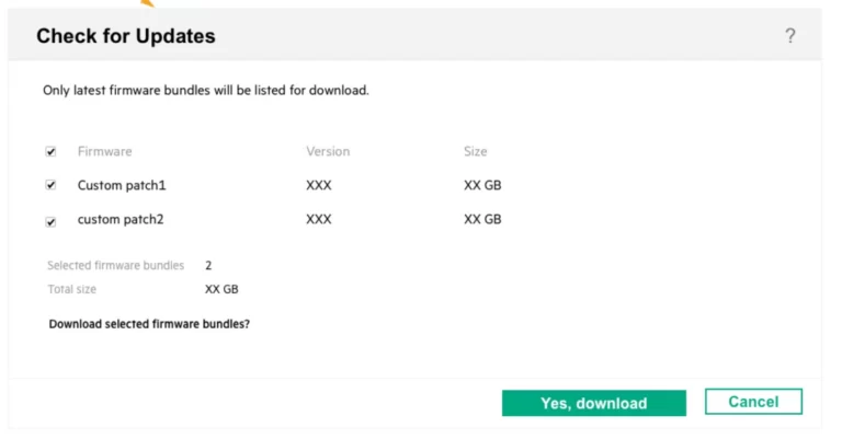
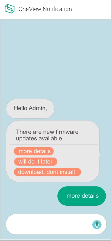
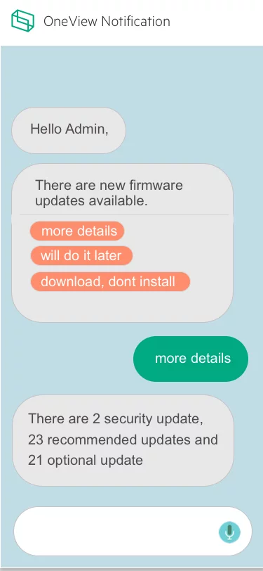
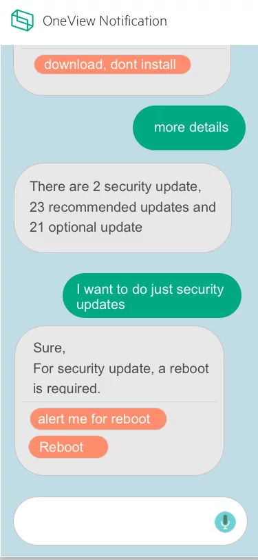
Final Designs
The final design incorporated:
Pre-update summary screen with estimated time, required space, and risks.
Automatic detection of critical updates.
Confidence-building UI: ratings, reviews, and progress indicators.
Simplified one-click update flow.
Result: Increased trust and adoption of firmware updates, reducing risk of outdated systems and downtime.

Additional Recommendation
Optimizing User Experience: A Case Study on Achieving 17% Higher Engagement and 5% Increased Sales in Dell Product Sections
Quick Overview
Contributions
- User Research & Stakeholder Interviews
- Competitive & Market Research
- User Persona & Journey Mapping
- Wireframing & UI/Visual Design
- Usability Testing & A/B Testing
- Workshop Facilitation
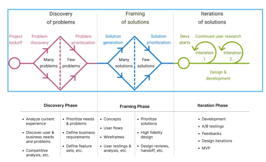
Framework
- Discovery & Framing
- Double Diamond Process
- Design Thinking
Impact
- 4X easier navigation (as reported by users)
- 17% increase in engagement on new sections
- 5% increase in Dell product sales
- 3% decrease in bounce rate
Impact
4X easier navigation (as reported by users)
17% increase in engagement on new sections
5% increase in Dell product sales
3% decrease in bounce rate
The Process
We follow a Double diamond (discover and framing) process in our product design
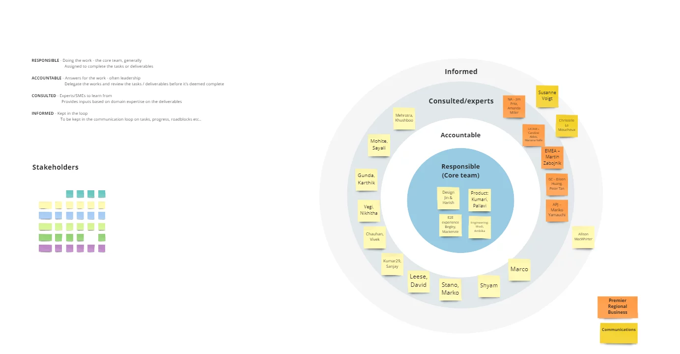
Stakeholder Mapping
Background
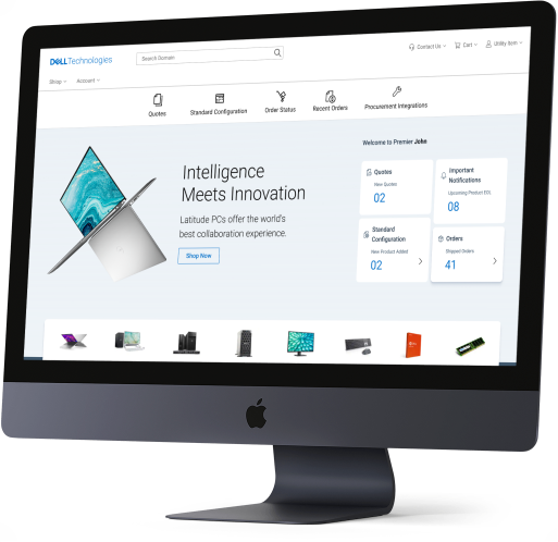
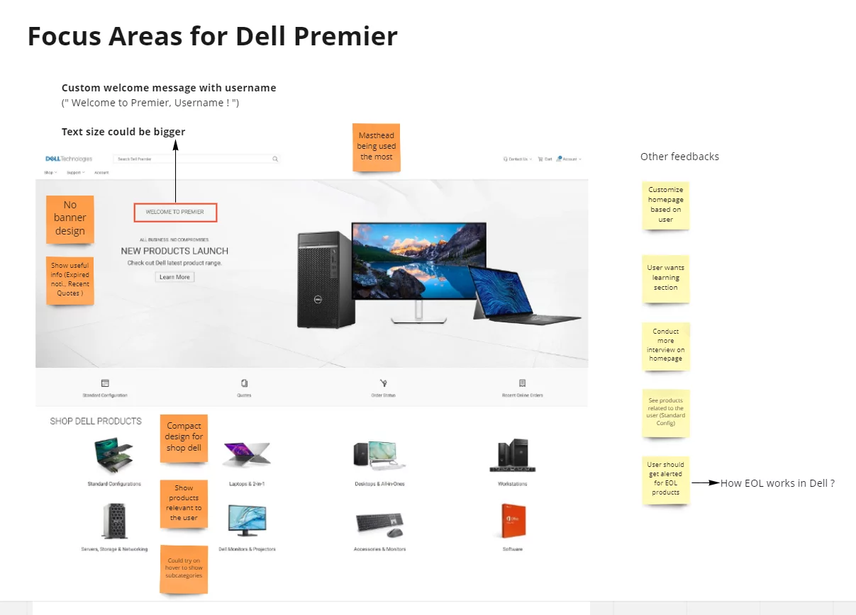
Dell.com Premier is a leading B2B e-commerce platform offering IT solutions worldwide. While the platform has been reliable for years, Dell leadership wanted to modernize the homepage to align with evolving standards and user expectations.
The Challenge: Balance Dell’s need for a refreshed look with preserving the usability that existing customers valued.
Problem Statement
How can we redesign the Dell.com B2B homepage to:
Deliver a modern and engaging experience
Retain the functional strengths of the legacy platform
Ensure usability, accessibility, and responsiveness across devices
Strengthen Dell’s brand identity
Market & Competitive Research
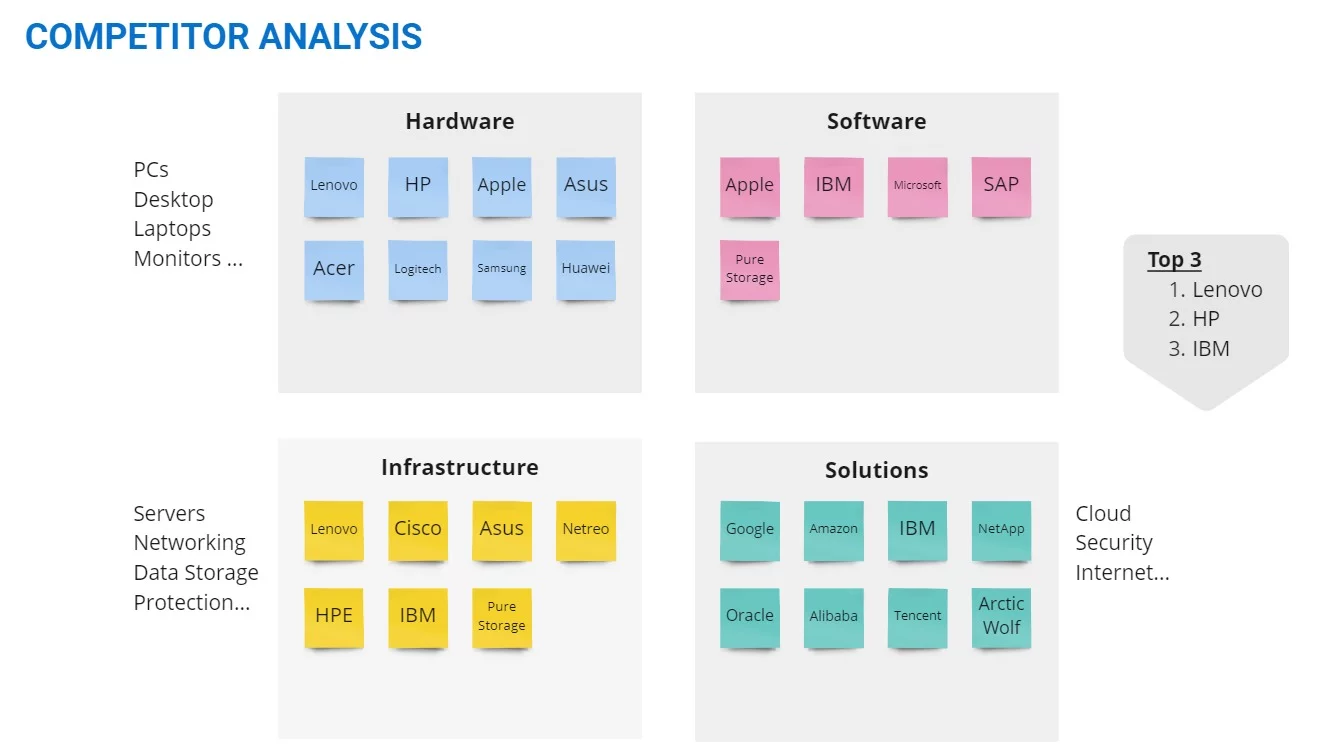
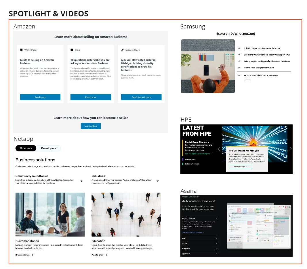
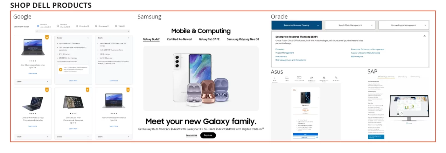
Analyzed B2B e-commerce competitors (HP, Apple, Google, Cisco, Alibaba, etc.) to identify best practices.
Key findings included:
Special categories above navigation (Lenovo, HP)
Minimalistic layouts (Apple, Google)
Vibrant imagery & brand voice (Apple, Logitech, WeWork)
Grid & card-based layouts (Samsung, WeWork, NetApp)
Accordion/collapsible articles (Cisco, Asana)
Interactive components & clear CTAs (WeWork, Asana)
After gathering the research data, we wanted to understand who are all performing better in this industry and what are their strengths and weakness and also wanted to understand what they are doing differently from others, and what each company is doing better.

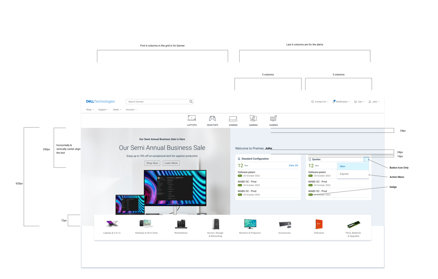
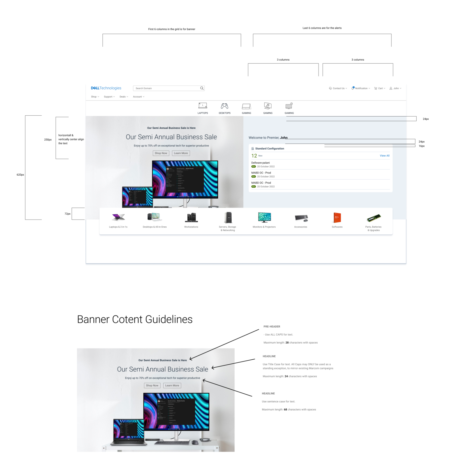
Quantitative Research
Surveyed 157 Dell Premier users across America, Europe, and APAC.
32% prioritized intuitive navigation
18% wanted quick access to support
Customization & quoting tools had less demand
Market Research
When I started to gather existing market research for similar industries, I found some alarming facts about the B2B e-commerce industry. Which made us even more serious about our exploration and research.


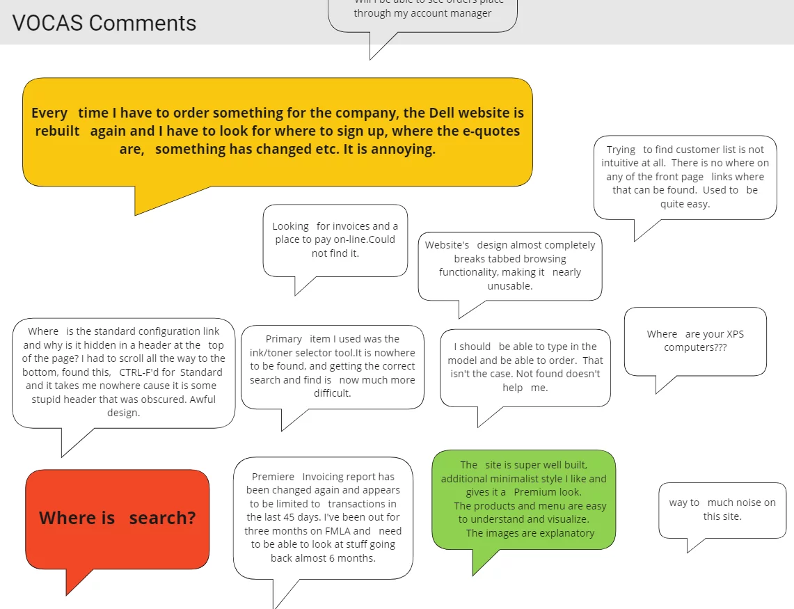
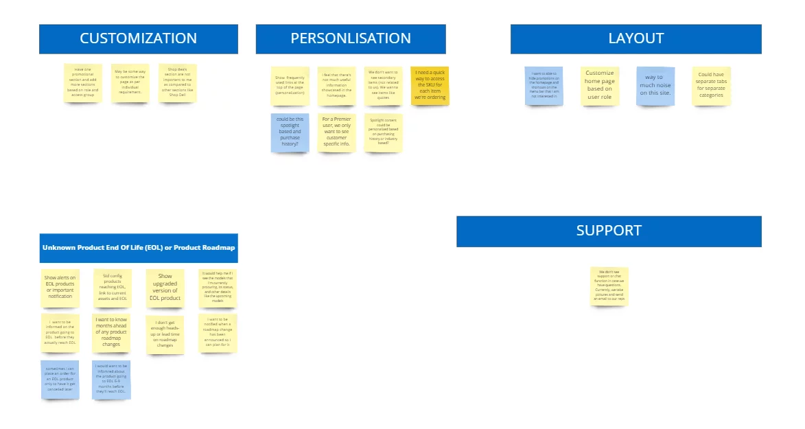
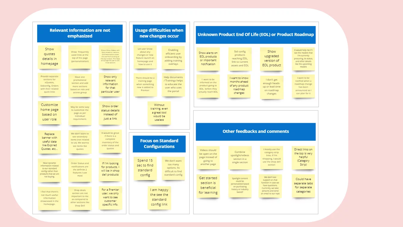
Gathered insights via Voice of Customer (VOCAAS) feedback
Conducted stakeholder interviews
Synthesized pain points into How Might We (HMW) statements

How Might We Statement
How might we help users quickly access frequently purchased Dell products?
How might we show relevant updates on order status and quotes?
How might we simplify navigation to reduce effort?
User Interview
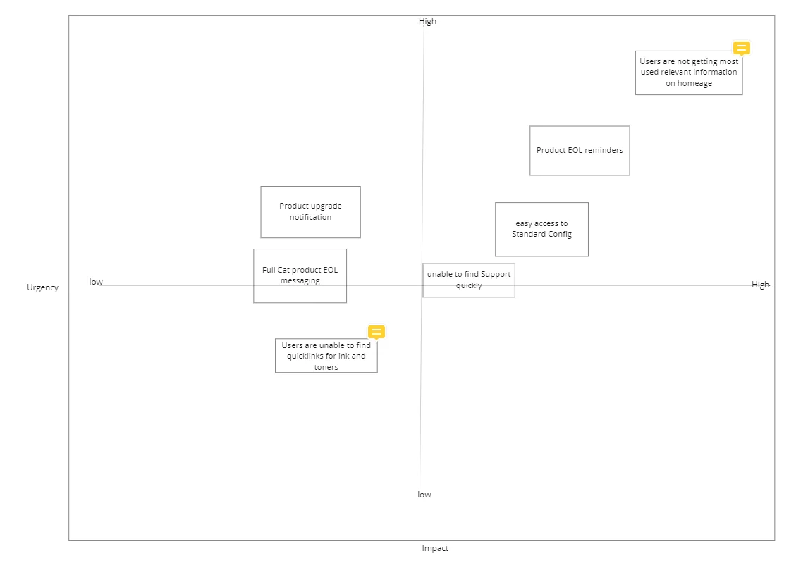
Problem Prioritization
Once we have gathered all the pain points from stakeholders, and users and also by analyzing the data, we came up with a few problem statements. Since our plan was not to solve all the problems at a time, we prioritized the problems.
User Persona


User Journey Map

Ideation & Wireframing
Facilitated workshops where participants sketched 8 design ideas each → shortlisted through dot-voting → evolved into wireframes.

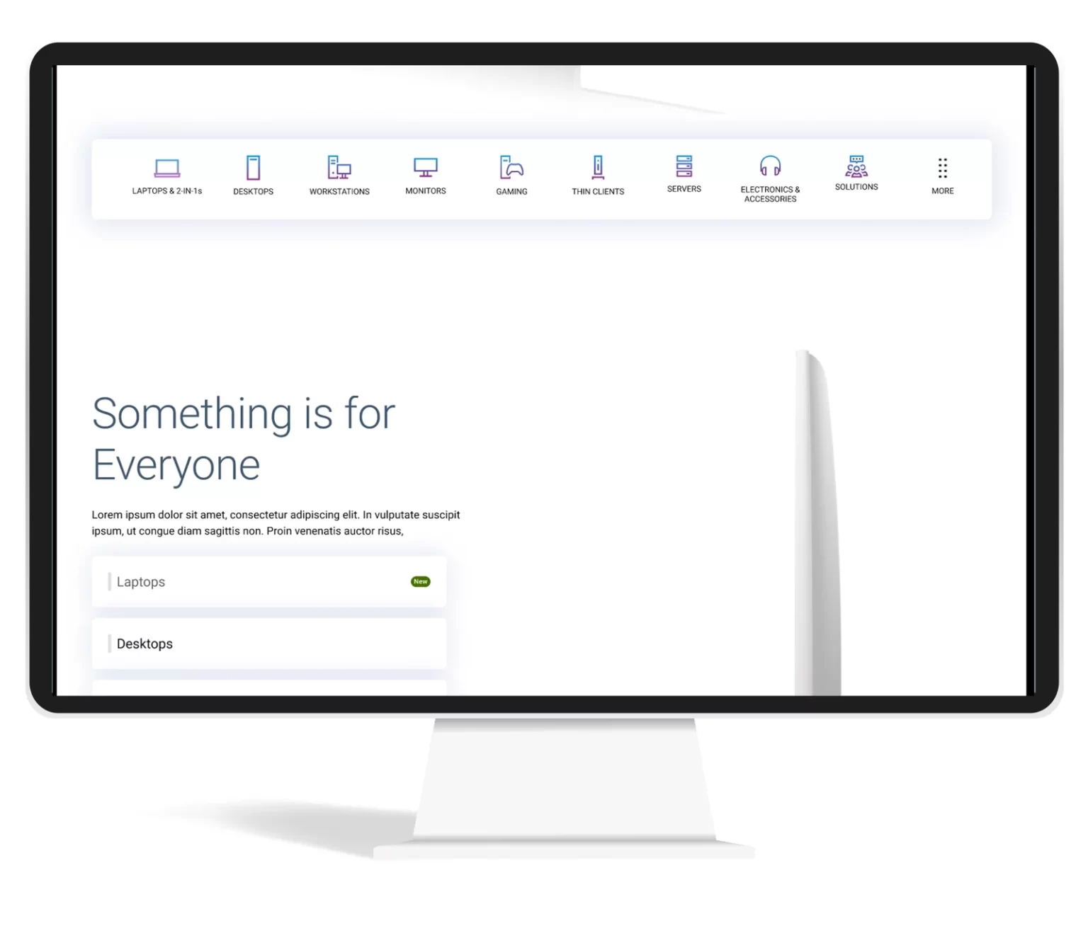
Before
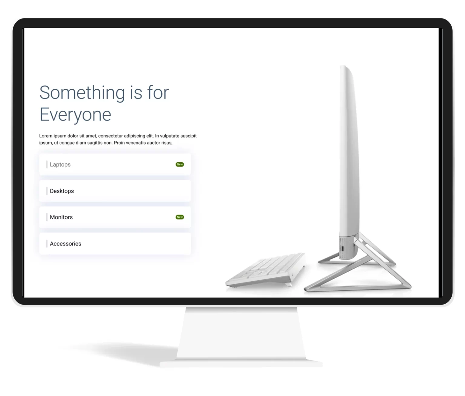
After Redesign

User Testing
Conducted unmoderated tests via usertesting.com
Key outcomes:
74% said navigation became 4X easier
95% reported reduced effort to find information
100% confirmed overview features reduced page-hopping
Positive verbatim: “Cleaner, more concise, categories outstanding”
74%
users mentioned new product category made navigation 4X easier
15 of 18
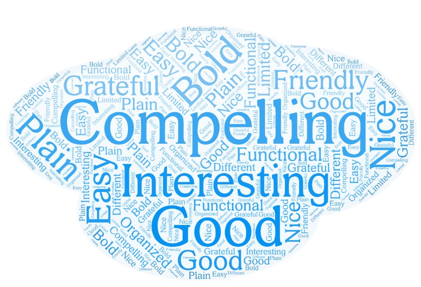
users expressed that the design is Compelling and Nice
95%
Users mentioned the new design take less effort to get what they are looking for
100%
Mentioned showing overview will reduce effort of going to different pages
Some of the verbatim from the user testing
AB Testing
Tested redesigned order status integration
Resulted in:
17%
Engagement on the newly added sections.
5%
Increase on the shop Dell product section
3%
Decrease in bounce rate
Final Impact
Modernized Dell’s B2B homepage while preserving usability
Increased engagement and conversions through research-driven design
Created a framework Dell can apply to future redesigns
Thinking beyond
Improved Accessibility: Voice-based navigation makes websites more accessible to individuals with disabilities, including those with visual impairments or motor disabilities. It allows users to navigate and interact with the website using their voice, eliminating the need for a mouse or keyboard.
Enhanced User Experience: Voice navigation can provide a more natural and intuitive way for users to interact with a website. Users can simply speak commands or questions, making it easier to find information, access features, and perform tasks on the site.
Efficient and Hands-Free: Voice navigation can be faster and more efficient than traditional point-and-click methods. Users can quickly jump to specific sections or pages on the website without the need to scroll or click through menus. It’s also hands-free, which can be especially useful in situations where users have their hands occupied (e.g., cooking, driving).
Multilingual Support: Voice-based navigation can offer multilingual support, allowing users to interact with the website in their preferred language. This can be a significant advantage for websites with an international audience.
Personalization: Voice assistants can use natural language processing and machine learning to understand user preferences and behavior. This enables websites to offer personalized recommendations, content, and experiences based on the user’s voice interactions and history, creating a more tailored and engaging user experience.
Design delivery
Final designs will be delivered with detailed engineering and marketing guidelines.
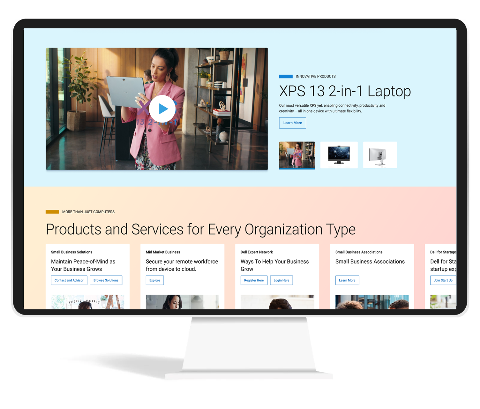
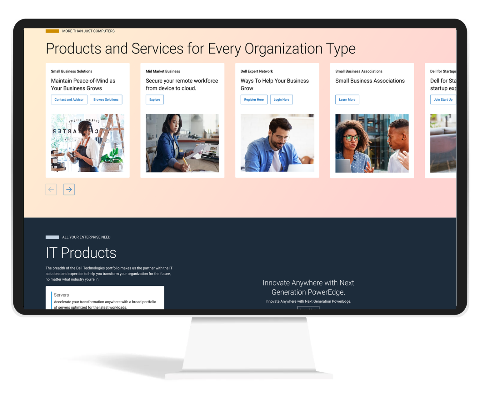
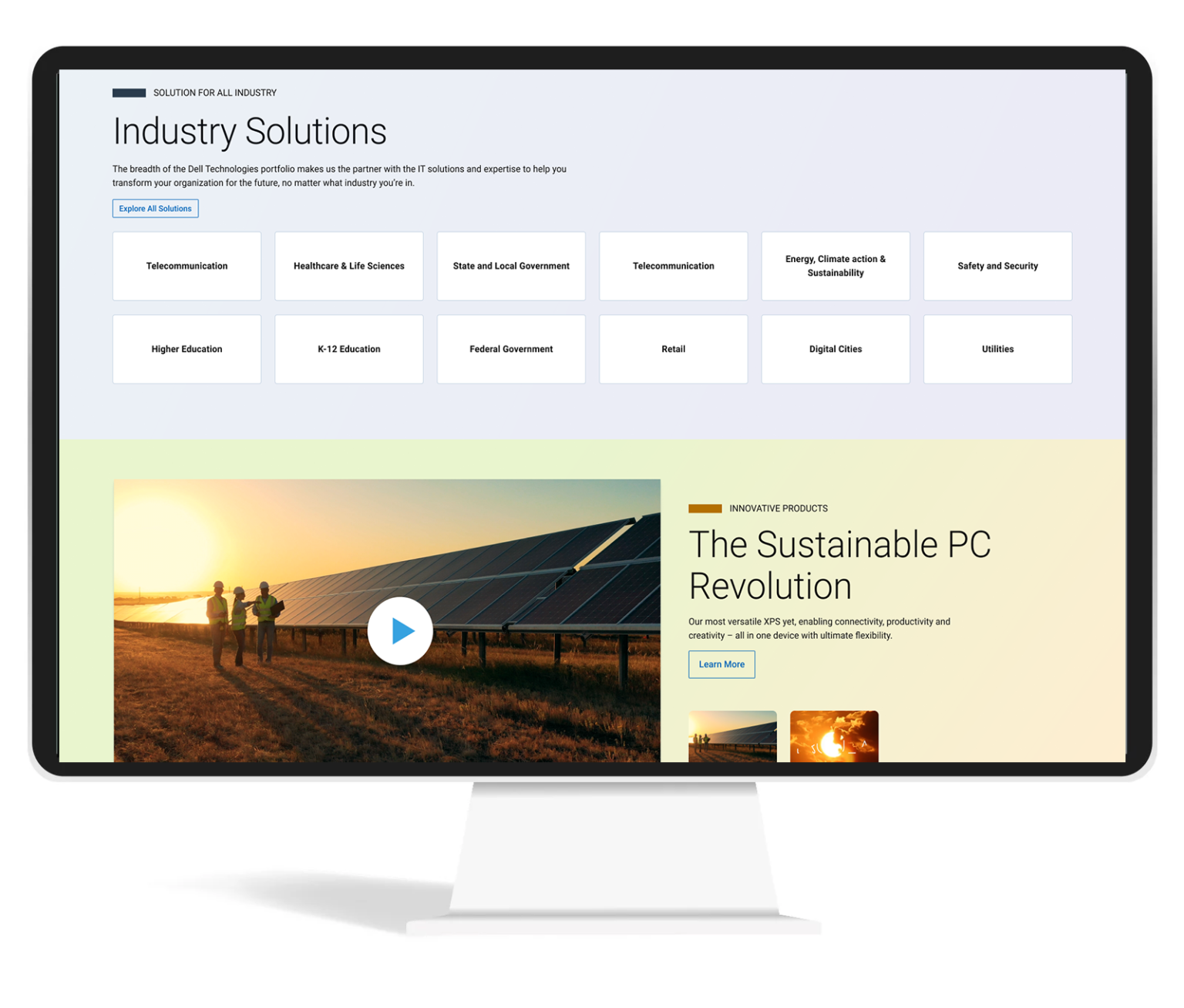
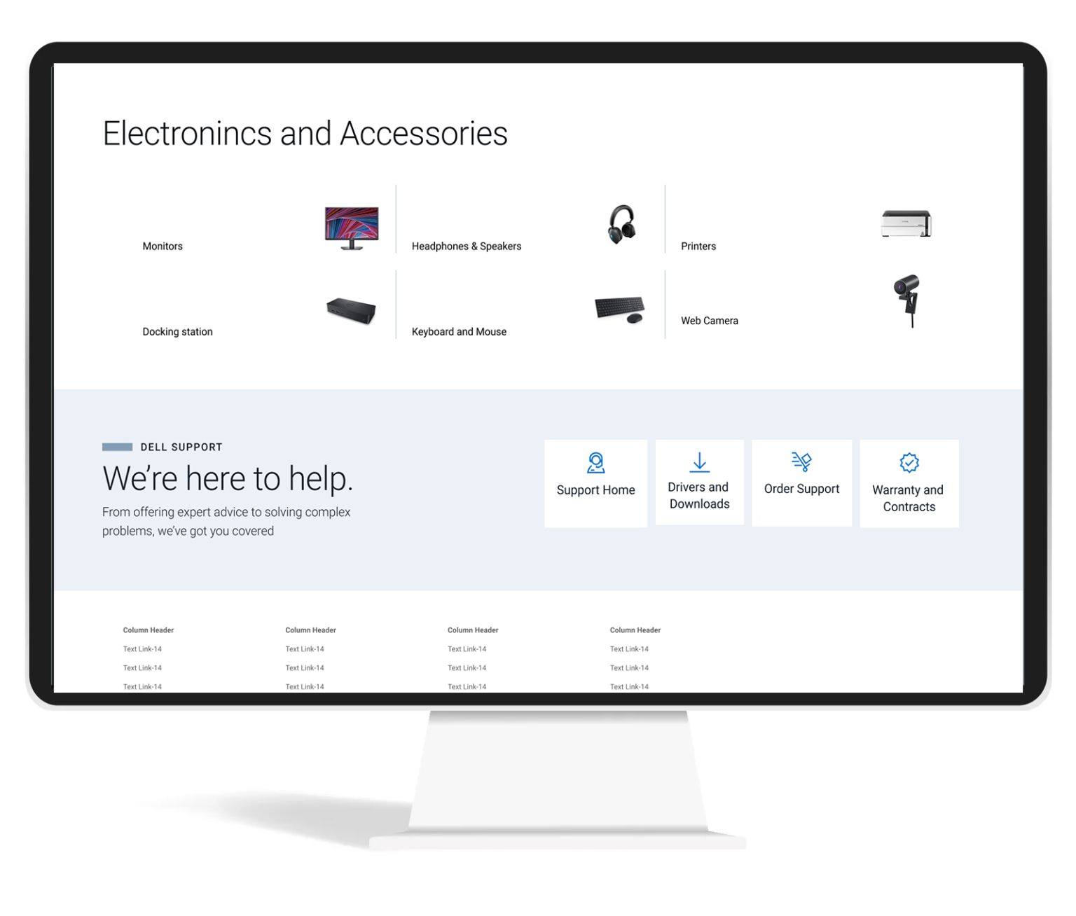
Driving Revenue and Engagement: A UX Case Study on Achieving a 3.2% Increase in Revenue per visit
Design Brief
Dell Technologies’ homepage needs to be redesigned to better connect with its audiences including consumers, small and medium businesses, and Enterprise. One-liner brief: Appealing design like apple and transaction like Amazon.
My Role
- Research
- Project time estimatiion
- Requirement Gathering
- Deciding on the Process
- Stakeholder Interaction
- User Testing
- UI and Visual Designs
- Partner with Engineering team
- Helping on Front-End Development
- Workshop Facilitation
Objective
Provide an experience that conveys our brand and corporate values, provides clear and direct navigation to Dell products and services, and promotes a successful completion of purpose.
The Process
We follow a Discovery and Faming process.

Goals
Business Goals
- Increase in click through rate and customer engagement
- Reduction in exit rate
- Reduction in bouse rate
- Increase in organic search traffic
- Increase CSAT
- Premium perception
- Brand love
Product Goals
- Increase Quality
- Increase Stability and Reliability
- Decrease page load time
- Google page speed score above 80
- 100% accessibility compliance
- Personalization
- Governance of quality
Anti-Goals
- Increase RPV
- Increase RPVr
- Increase AOV
- Increase Margin per visitor
- Increase CV
Stakeholder Mapping

Research
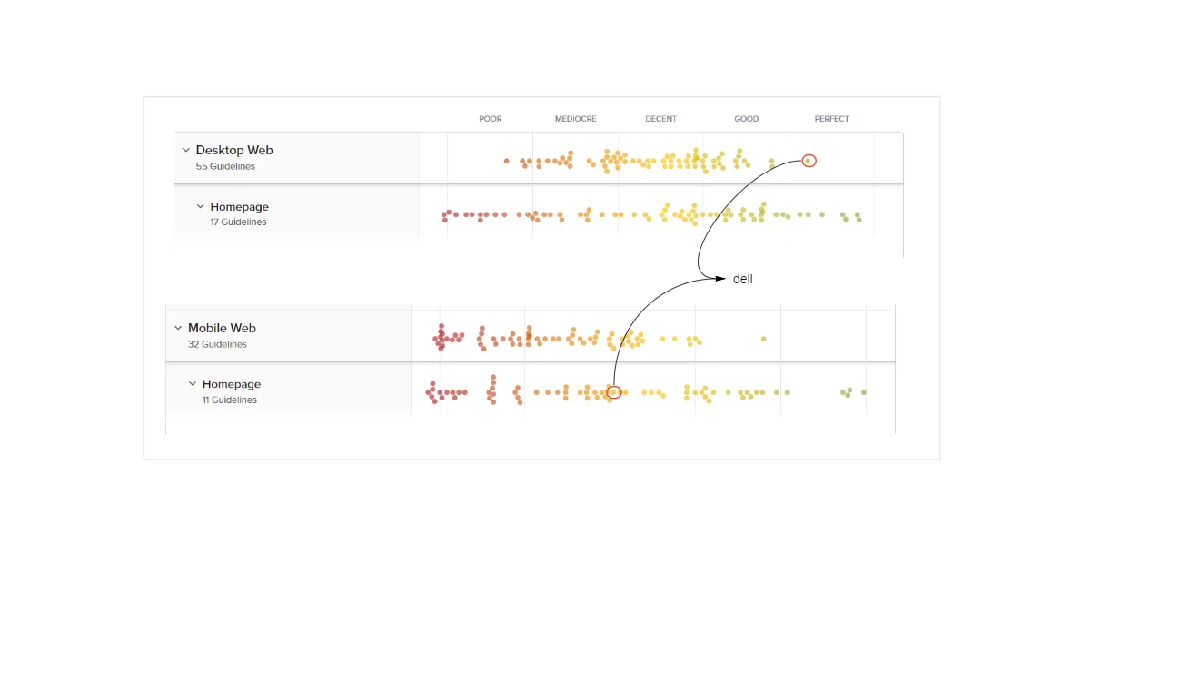
Baymard Research Findings
As not to reinvent the wheel again, we went through the research papers of Baymard to understand which are the top performing e-commerce website where Dell stand and what is their suggestion to improve the page.
Even though Dell is in a good position, we wanted to improve further.

Competitive Analysis
Compare a few competitors’ websites and analyze what they are doing differently from others, and what each company is doing better.

Samsung
- Clean design, shows all major categories of product
- Shows sustainability
- Showcases the latest innovations/products. Calls out of new arrivals
- Uses bigger/bold fonts – but not too much text
- Discounts are displayed, but in only one place, not distracting from the rest of the page.
- Using tables on different modules to unfold more content on user clicks
- Using hover to unfold more information

HP Enterprise
- It is a different site altogether from a retail site
- Using a large above-the-fold banner with a carousel (no auto-rotate, only on user click)
- –Banner links user to ebook/PDF
- On scroll sticky masthead. On page load masthead and on hover masthead are slightly different. I think the masthead is a transparent background on the page load.
- Lots of big images and some image overlays
- Subtle animation on part of the page
- Highlights – HP Greenlake/cloud/services and less about products
- Lots of interactive elements to show/hide content
- Link to a virtual tour
- Highlights sign in
Research Existing Analytical Data
Analyze current design As the first step in the research, we analyzed our existing homepage using content square (formally clicktale). Our objective was to check where we get more engagement, and more conversion and also understand what is the reason for less engagement in some sections of the page.
Key findings
- Users are using the laptop and desktop categories the most.
- First-time users use main navigation more
- 82% of home page category purchases buy on the visit and are the fastest purchasers of any segment
- The main navigation is the most used feature on the homepage followed by search.
- 46% of users scroll only till they populate categories.
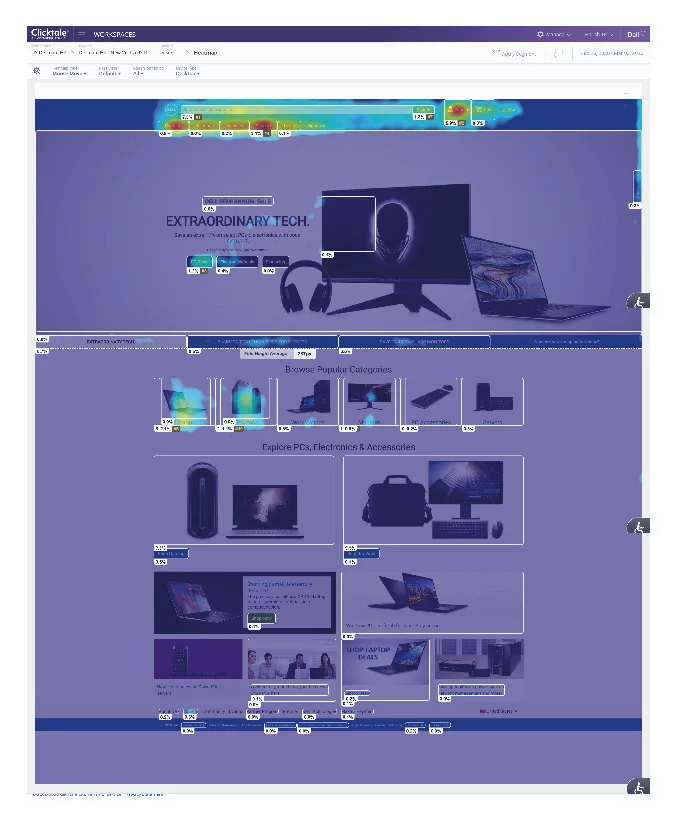


we then synthesized the analytical data and made affinity mapping of the findings based on the commonalities the commonalities.

User Interview
By this time we had enough data to go to users to gather their pain points. Having all this data was very easy for us to write a script for user interviews.
Conducted user interviews for B2B users, B2C users, and Gamers. We recruited users through the usertesting.com platform.
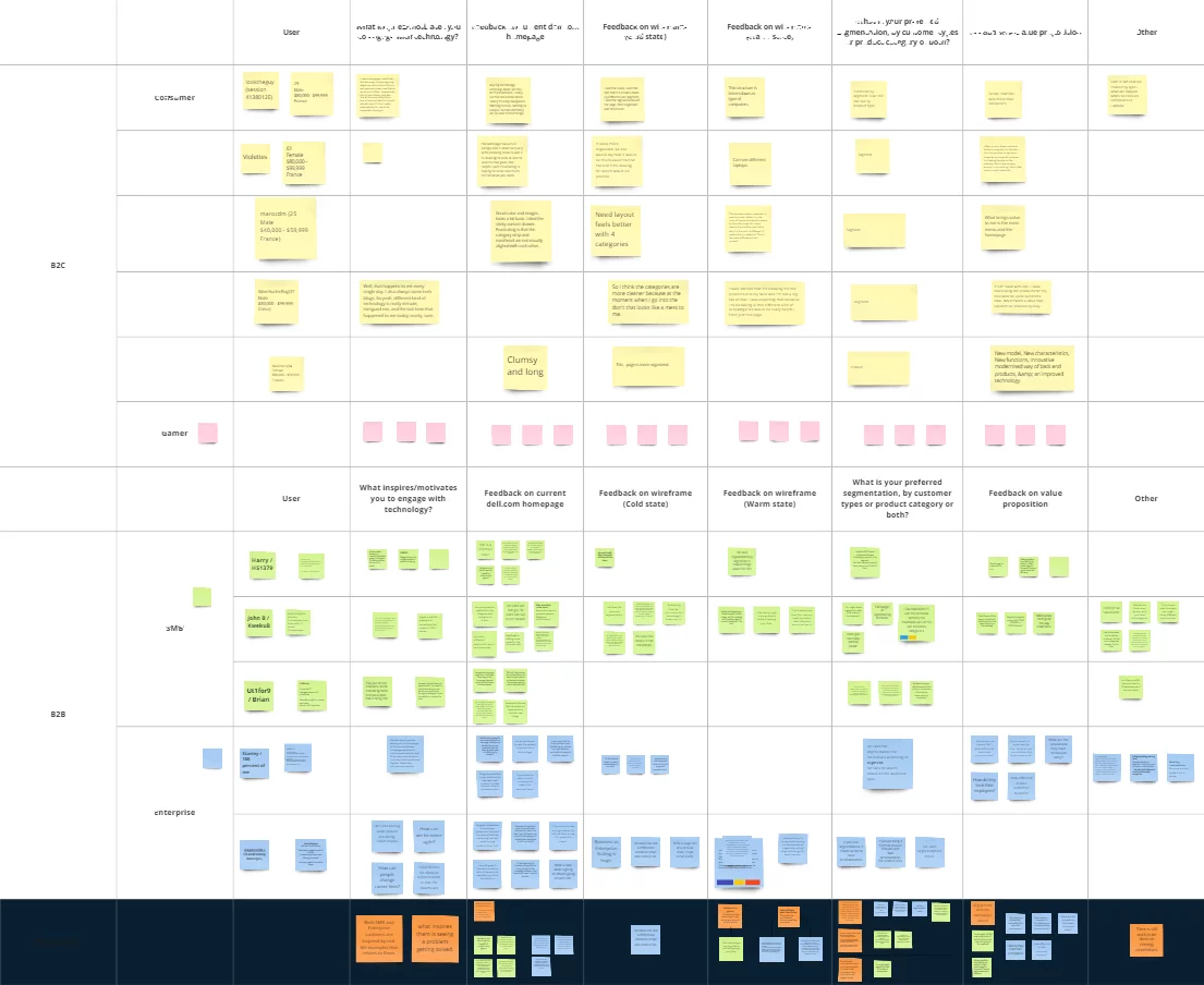

Key Interview Takeway

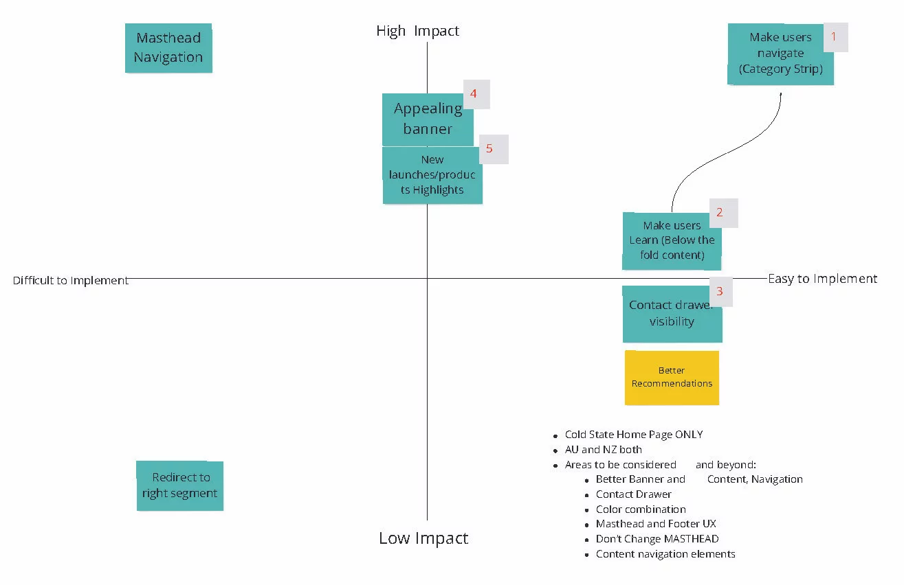
Problem Prioritization
This time we got most of the stakeholders and we did the problem prioritization. We could able to refine the problems which needs to be addressed first.
Discovery Takeways
Brand: Effectively communicate on the homepage that Dell Technologies provides complete E2E technology needs
Personalization: Cold state: showcase the breadth of products and solutions for a broad spectrum of customers.
Warm state: Provide more relevant content that aligns with each persona and supports navigation paths.
Navigation: Our target audience is very broad, from consumers to enterprise customers. Creating a clear entry path for each target audience guides their journey.
Content & Experience
- Storytelling: focus on highlighting user needs and benefits instead of product features.
- inspire and increase customer engagement using immersive and relevant content.
- Highlight new/special products. services solutions etc.
- Show value proposition
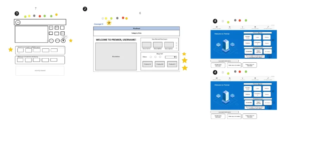
Wireframing
Crazy 8’s is a core Design Sprint method. It is a fast sketching exercise that challenges people to sketch eight distinct ideas in eight minutes. The goal is to push beyond your first idea, frequently the least innovative, and to generate a wide variety of solutions to your challenge.

Iterative Approach
From the Ideas I gathered during the Crazy 8 rapid prototyping, I went ahead with asking the stakeholders to vote took the winning prototype, and created an interactive prototype using webflow so that I could run quick user testing.
- Learning from the testing of the prototype:
First time
- users look for product categories. The mental model of the user is to see small category strip above the first first
- The design we tested with bigger product category thumbnail did not resonate with the user.
- Users has banner blindness in many sections in the homepage
- Users are least interested in the sections which has just products.
- Users expect newly launched products in the hero banner
Returning User
- Returning users would like to see the products which they are interested in (personalization)
- Users were happy when they are shown the products which browsed in the past. Products similar to what they browsed in the past
- Chances of purchasing the products increased when we compared the price compared to previous visit (discounted price)
Returning Customer
- Returning customers were able to browse the compatible accessories without much research.
- Showing order status was very easy for the users, they could see the status without going to the account page
- Showing products in cart was interesting for many users.
Users felt the design was lacking in recommending products based on their job/industry etc.
I continued to iterate the designs on the feedback we received from users.
Recommended designs
Thinking Beyond the Ask
I tried one more addition idea of navigating by just using voice commands.
Advantages of this:
- Easy navigation just by using voice.
- Voice will be additional navigation option for main navigation and search
- Can collect these data and identify the user intend and personalize content
- Users will be more open to voice than typing
- In case users has additional questions, we can direct them to live customer executives. Users will be continuing in the same experience.
Outcome

% Increase in RPV(Revenue per visit)
0
% Decrease in Exit and Bounce Rate
0
% Increase in Conversion
0
Learnings
- Returning visitors are more likely to purchase products
- Personalization help the user in purchase decision
- If the personalization is not perfect, don’t do personalization
- Too many marketing content will make banner blindness in the user
Next Step
- Continue iterate based on the feedback we receive from the user.
- Make personalization perfect so that we can understand the intend of the user.