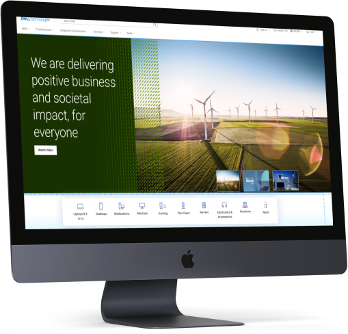
Driving Revenue and Engagement: A UX Case Study on Achieving a 3.2% Increase in Revenue per visit

Design Brief

Dell Technologies’ homepage needs to be redesigned to better connect with its audiences including consumers, small and medium businesses, and Enterprise. One-liner brief: Appealing design like apple and transaction like Amazon.   

My Role

Objective

Provide an experience that conveys our brand and corporate values, provides clear and direct navigation to Dell products and services, and promotes a successful completion of purpose.

The Process

We follow a Discovery and Faming process.

Design Process

Goals

Business Goals

  • Increase in click through rate and customer engagement
  • Reduction in exit rate
  • Reduction in bouse rate
  • Increase in organic search traffic
  • Increase CSAT
  • Premium perception
  • Brand love

Product Goals

  • Increase Quality
  • Increase Stability and Reliability
  • Decrease page load time
  • Google page speed score above 80
  • 100% accessibility compliance
  • Personalization
  • Governance of quality

Anti-Goals

  • Increase RPV
  • Increase RPVr
  • Increase AOV
  • Increase Margin per visitor
  • Increase CV

Stakeholder Mapping

Research

Baymard Research Findings

As not to reinvent the wheel again, we went through the research papers of Baymard to understand which are the top performing e-commerce website where Dell stand and what is their suggestion to improve the page.

Even though Dell is in a good position, we wanted to improve further.

Competitive Analysis

Compare a few competitors’ websites and analyze what they are doing differently from others, and what each company is doing better.

Samsung

  • Clean design, shows all major categories of product
  • Shows sustainability
  • Showcases the latest innovations/products. Calls out of new arrivals
  • Uses bigger/bold fonts – but not too much text
  • Discounts are displayed, but in only one place, not distracting from the rest of the page.
  • Using tables on different modules to unfold more content on user clicks
  • Using hover to unfold more information

HP Enterprise

  • It is a different site altogether from a retail site
  • Using a large above-the-fold banner with a carousel (no auto-rotate, only on user click)
  • –Banner links user to ebook/PDF
  • On scroll sticky masthead. On page load masthead and on hover masthead are slightly different. I think the masthead is a transparent background on the page load.
  • Lots of big images and some image overlays
  • Subtle animation on part of the page
  • Highlights – HP Greenlake/cloud/services and less about products
  • Lots of interactive elements to show/hide content
  • Link to a virtual tour
  • Highlights sign in

Research Existing Analytical Data

Analyze current design As the first step in the research, we analyzed our existing homepage using content square (formally clicktale). Our objective was to check where we get more engagement, and more conversion and also understand what is the reason for less engagement in some sections of the page.

Key findings

  • Users are using the laptop and desktop categories the most.
  • First-time users use main navigation more
  • 82% of home page category purchases buy on the visit and are the fastest purchasers of any segment
  • The main navigation is the most used feature on the homepage followed by search.
  • 46% of users scroll only till they populate categories.

we then synthesized the analytical data and made affinity mapping of the findings based on the commonalities the commonalities.

User Interview

By this time we had enough data to go to users to gather their pain points. Having all this data was very easy for us to write a script for user interviews.

Conducted user interviews for B2B users, B2C users, and Gamers. We recruited users through the usertesting.com platform.

Key Interview Takeway

Problem Prioritization

This time we got most of the stakeholders and we did the problem prioritization. We could able to refine the problems which needs to be addressed first.

Discovery Takeways

Brand: Effectively communicate on the homepage that Dell Technologies provides complete E2E technology needs

Personalization: Cold state: showcase the breadth of products and solutions for a broad spectrum of customers.

Warm state: Provide more relevant content that aligns with each persona and supports navigation paths.

Navigation: Our target audience is very broad, from consumers to enterprise customers. Creating a clear entry path for each target audience guides their journey.

Content & Experience

  • Storytelling: focus on highlighting user needs and benefits instead of product features.
  • inspire and increase customer engagement using immersive and relevant content.
  • Highlight new/special products. services solutions etc.
  • Show value proposition

Wireframing

Crazy 8’s is a core Design Sprint method. It is a fast sketching exercise that challenges people to sketch eight distinct ideas in eight minutes. The goal is to push beyond your first idea, frequently the least innovative, and to generate a wide variety of solutions to your challenge.

Iterative Approach

From the Ideas I gathered during the Crazy 8 rapid prototyping,  I went ahead with asking the stakeholders to vote took the winning prototype, and created an interactive prototype using webflow so that I could run quick user testing. 

  • Learning from the testing of the prototype:

First time

  • users look for product categories. The mental model of the user is to see small category strip above the first first
  • The design we tested with bigger product category thumbnail did not resonate with the user. 
  • Users has banner blindness in many sections in the homepage
  • Users are least interested in the sections which has just products. 
  • Users expect newly launched products in the hero banner

Returning User

  • Returning users would like to see the products which they are interested in (personalization)
  • Users were happy when they are shown the products which browsed in the past. Products similar to what they browsed in the past
  • Chances of purchasing the products increased when we compared the price compared to previous visit (discounted price)

Returning Customer

  • Returning customers were able to browse the compatible accessories without much research.
  • Showing order status was very easy for the users, they could see the status without going to the account page
  • Showing products in cart was interesting for many users. 

Users felt the design was lacking in recommending products based on their job/industry etc.

I continued to iterate the designs on the feedback we received from users. 

Recommended designs

Thinking Beyond the Ask

I tried one more addition idea of navigating by just using voice commands. 

Advantages of this:

  • Easy navigation just by using voice. 
  • Voice will be additional navigation option for main navigation and search
  • Can collect these data and identify the user intend and personalize content
  • Users will be more open to voice than typing
  • In case users has additional questions, we can direct them to live customer executives. Users will be continuing in the same experience.

Outcome

0
% Increase in RPV(Revenue per visit)
0
% Decrease in Exit and Bounce Rate
0
% Increase in Conversion

Learnings

  • Returning visitors are more likely to purchase products
  • Personalization help the user in purchase decision
  • If the personalization is not perfect, don’t do personalization
  • Too many marketing content will make banner blindness in the user

Next Step

  • Continue iterate based on the feedback we receive from the user. 
  • Make personalization perfect so that we can understand the intend of the user.